It’s often helpful to see changes plotted over time in order to understand market trends and movement, and even more importantly, it provides a reference by which to gauge the current market environment.
Local market researcher & economist James Hough was generous enough to provide us with a animated powerpoint slideshow that illustrates the relationship between Per Capita Income to Home Values from 1980 to now. A big thanks to James for providing us this information.
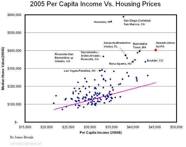
The data point highlighted in red is the Newark-Union, NJ-PA Metropolitan Statistical Area (MSA). That data point can be used as a proxy for the Northern NJ metro area. This is perhaps the most useful illustration of the change in Per Capita Income and Home Values I’ve seen yet. It beautifully illustrates the prior RE crunches, as well as the inflation of the current bubble (my words, not his).
Mr. Hough is a regular on this blog, I’m sure he would have no problems fielding any questions about his work.
Caveat Emptor,
Grim
Edit: Mr. Hough updated the final slide in the series to include some additional MSAs for comparison purposes:
I know for a fact that MULTIPLE families are living in single-family homes these days because most families can’t afford their homes on their own.
So basically, overcrowding in the homes is very common place which leads to higher taxes, overcrowded schools, etc.
-Richie