
Preliminary June sales and inventory data for Northern New Jersey (GSMLS) is in. Please note that this data is subject to revision.
The first graph plots the unadjusted sales data (closed sales) for the counties listed. Please note the lower bound of the graph, it is set to 500, not to zero. I do this to emphasize the seasonal nature of the Northern NJ market.
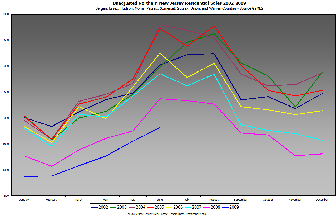
(click to enlarge)
The second graph is another view at the sales data for the full year. Please note that this graph does cross at zero.

(click to enlarge)
The third graph displays only June sales, 2001 to 2009 YOY.

(click to enlarge)
The fourth graph displays an overlay of Sales and Inventory from 2003 to 2009.
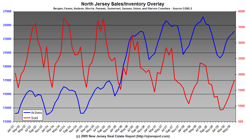
(click to enlarge)
The fifth graph displays the year over year change in inventory on a month by month basis.
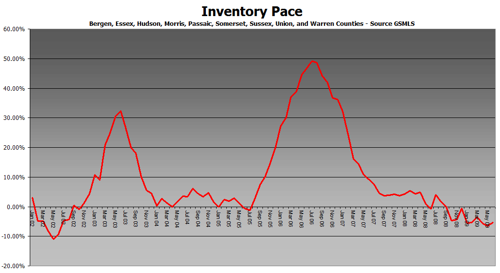
(click to enlarge)
The sixth graph displays the year over year change in sales on a month by month basis.
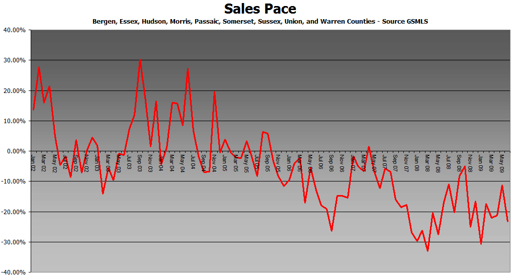
(click to enlarge)
The last graph displays the absorption rate (not seasonally adjusted), in months:
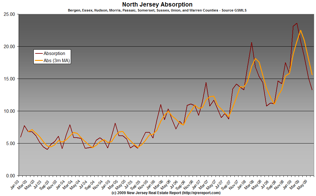
(click to enlarge)
Bonus Graphs!
March Sales By County (log scale):
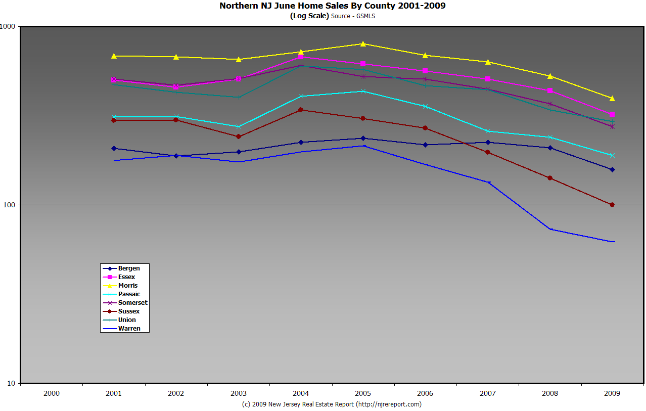
(click to enlarge)
First!
Shipping industry in deep water
Worldwide container traffic is expected to drop more than 10% this year.
Trade at international ports is on track to drop more than 10% this year, one of the steepest declines ever, according to a new maritime industry report.
Cargo ships will carry 27 million fewer containers by year’s end than they did in 2008
http://www.latimes.com/business/la-fi-ports8-2009jul08,0,53929.story
Frist!
From Bloomberg:
U.S. Housing Market Is Cursed by Brain Freeze: John F. Wasik
If you are buying or selling a home in a market glutted with distressed properties, it’s time to change your attitude.
Don’t be misled by pundits saying the bottom may be visible in this stultifying decline. The real-estate recession will continue unless a massive brain freeze thaws. Buyers are afraid of purchasing a home at the wrong price while millions of sellers are locked into unrealistic listing prices.
Some good news after almost three years of deterioration is welcome, of course. In the latest S&P/Case-Shiller Home Price Index of 20 major U.S. cities, values fell 18 percent in April. That pace was slower than forecast.
That’s cold comfort as the collective psychology of the U.S. home market has been short-circuited for some time. We are largely hostage to the way our mind works. According to prospect theory, pioneered by psychologists Amos Tversky and Daniel Kahneman, the idea of losing money is a much more powerful motivator than a gain.
Our brains are telling us it’s painful to price our homes to reflect 20 percent to 50 percent losses in market values. So buyers overprice houses and wait for something to happen.
A myopic, loss-averse view of the market, for example, means listing for $500,000 or more when comparable upscale homes are selling for $400,000 or less. I have seen it in my suburban Chicago neighborhood, where homes have been on the market and unsold for years.
…
Our loss-aversion fears are so powerful that they override our logic circuits. We tend to ignore economic reality because we are emotionally anchored to our homes and values based on boom-era prices. It’s like holding on to a favorite stock long after it has tanked.
There are also influential cerebral centers for optimism and self-confidence. We hang on to properties, falsely believing that prices will rebound to the bubble years of 2005-2006.
Actual market conditions don’t offer much hope, however. “Real house prices have fallen by more than 30 percent from their peaks in 2006, destroying more than $6 trillion in housing wealth,” writes economist Dean Baker in his Housing Market Monitor. “They have been falling at the rate of 2 percent per month thus far in 2009. There is no evidence that this rate of price decline has slowed, much less stopped.”
Grim – please check your email. Thanks!
Government Agencies, Washington Post Targeted in Cyberattack
http://www.washingtonpost.com/wp-dyn/content/article/2009/07/08/AR2009070800066.html?wprss=rss_business
couple people were talking about this yesterday
http://blogs.usatoday.com/thehuddle/2009/07/kazemis-exboyfriend-has-rap-song-about-a-killing-with-eery-chilling-lyrics-.html
still think it was the girl who killed the QB?
Many borrowers are not getting help under president’s modification or refinancing plan. Officials don’t expect problems to be fixed until the fall
http://money.cnn.com/2009/07/07/news/economy/Obama_mortgage_plan/index.htm?postversion=2009070804
T Boone Pickens Shocker
http://news.yahoo.com/s/nm/20090708/bs_nm/us_pickens_windfarm
Meriwether shutting fund after 44% loss.
http://www.bloomberg.com/apps/news?pid=20601087&sid=aU2YYpahTt0w
Deutsche is selling the last of the Macklowe buildings it repo’d. Harry Macklowe paid $1.74 bil for the place in `07, DB sold it for $605mil. Ow.
It’s @ 49th & 8th btw.
“Real house prices have fallen by more than 30 percent from their peaks in 2006, destroying more than $6 trillion in housing wealth,” writes economist Dean Baker in his Housing Market Monitor. “They have been falling at the rate of 2 percent per month thus far in 2009. There is no evidence that this rate of price decline has slowed, much less stopped.”
Dear Sellers, let me translate this for you: this means that the overpriced shit* box of yours with a tag of $600,000 is causing you to hemmorage $3,000 per week. Have a nice day.
it’s probably been linked a dozen times, but this is a must-read (new VF story on AIG)
http://www.vanityfair.com/politics/features/2009/08/aig200908?printable=true¤tPage=all
Latest Food Stamp Data Makes for Sober Reading
Fifteen months ago, Britain’s Independent newspaper ran the following cover story, “USA 2008: The Great Depression,” which drew on the fact that a then-record 28 million Americans depended on food stamps to survive.
While many commentators in the U.S. scoffed at what they claimed was sensationalist drivel, I’m wondering if they still feel the same way today, especially given the news that a record 33.8 million participated in the Agriculture Department’s Supplemental Nutrition Assistance Program in April (not to mention, of course, all the other dismal reports we’ve seen over the past year or so)?
http://www.financialarmageddon.com/2009/07/food-stamp-bubble.html
#13 – Thanks yikes, I hadn’t seen this yet.
About Pickens:
People forget (or never knew, in some instances) that electric transmission lines exert friction on the flow of electricity. Consequently, unless one uses supercooled wires, there is a limit to the distance one can transmit vast quantities of electricity and remain economically viable.
West Texas is not close to much and it would not surprise me if the heat would cause an increase in resistance as the wires expand in length and droop.
About food stamps, and related matters:
There seems to be a very large portion of the population that believes that introspection and dispassionalt analysis of our economic situation is dishonorable and some kind of an attack on the greatness ofAmerica, and that one is obliged to declare everything about us “the best,” or “the grratest.”
Without question, I accept the greatness of this nation and the ideas and ideals upon which the republic is built. That said, we became great by doing great things and behaving in a great manner. Unless we are honest with ourselves, we will never be ableto solve our very real problems or correct our very real faults and that will cause us far greater pain and disruption than just being honest about them and fixing our problems.
Shouting that one’s team is the greatest means little if the team fails to perform on the field. It is the same way for nations: ; a lesson the French seem to have failed to recognize, much to our amusement. If we don’t start recognizing and solving our own problems, we may find ourselves in the same boat as out tri-colored friends across the sea.
Good read on AIG.
http://www.vanityfair.com/politics/features/2009/08/aig200908?printable=true¤tPage=all
Shore,
The guys a billionaire. He didn’t realize this little transmission line problem BEFORE he drew up his plans:)
Shore (16) – to some degree the lack of a customer base has to increase the cost due to electrical resistance, but the larger issue is the lack of transmission lines or any infrastructure for the project needed to transport the power to the grid.
HEHE,
He is a “visionary.” Physics is something for the operational guys to deal with. With any luck, AFTER financing is secured.
GA,
True enough, and for that reason one would think that building suca a facility in, oh, say, Western Mass., or Northern Ind., or east of LA, would make more sense, se any new lines would be short and close to much larger markets. Then again, TBP is not from those places, so they don’t matter.
suca= such, at least it does at this traffic light.
Personal opinion, trillions of dollars in stimulus spending would have been better spent on food stamp programs and extension of unemployment benefits. These are things that are simple and that the government does well. The government should not be involved in the banking, auto or other businesses.
Ok, so does anyone have opinions/analysis/forecasts based on the June data that grim has supplied?
re: Pickens, I surprised actually, I gather the Obama administration dosen’t really want Green energy if Pickens cannot get financining.
He had everything in place last year, but nobody would finance the 12 Billion dollar deal. Pickens even went out and did an end run around most of the landowners that stood between his land and Dallas about 250 miles away by becoming a Water Utility which gave him right of way across all of the properties, his land which has a giant underground aquifer and he was planning on building a pipeline and also transmission lines for his wind farm.
Strange times we live in. How will we get Green Energy in any kind of real large volume if people like Pickens cannot get anyone to finance the construction?
thanks for the figures grim.
pretty nice slope, from April to June even though numbers are alot lower, still some activity. I would bet those are comps, desperate sellers, or just some good deals out there.
It appears this summer is already over for the RE markets.
Its going to be a long cold winter for many.
When the stimulus runs its course (delaying municipalities bankrupcies), this market is going to get nasty.
I really don’t see the market coming back next year either.
The jig is up for the next year or two.
SAS
HEHE,
I would have liked to have seen the money spent on placing photovoltaic cells on every home and business structure in the US. The tech is far better than it used to be but not yet at the point of being viable for average people to justify the cost. Doing so would have resulted in plants being built, people hired to manufacture, install, and service the equipmeny, and would have resulted in our not having to import any energy from outside the Western Hemisphere.
12.gary says:
July 8, 2009 at 7:56 am
“Real house prices have fallen by more than 30 percent from their peaks in 2006, destroying more than $6 trillion in housing wealth,” writes economist Dean Baker in his Housing Market Monitor. “They have been falling at the rate of 2 percent per month thus far in 2009. There is no evidence that this rate of price decline has slowed, much less stopped.”
Dear Sellers, let me translate this for you: this means that the overpriced shit* box of yours with a tag of $600,000 is causing you to hemmorage $3,000 per week. Have a nice day.
gary: this is like a cool glass of water on a 95 degree day…..
#25 gary,
Seems like the housing market is still deteriorating. :P
these property taxes are killing the RE market.
and wait till the pension bombs goes off. tick..tick…tick…
but hey, it doesn’t matter.
turn back on the pedophile michael jackass records, do the moonwalk, cause thats the only thing that is important.
SAS
#25 gary,
buy now or be priced out.
you don’t need a down payment.
real estate never goes down.
and the moon is made of cheese.
SAS
SAS,
The state-funded pension issue is the main thing holding us back from picking up an occasional-use place in NJ, NY, and other nearby areas. We can afford a place, but we are not willing to put our necks on the line for unlimited property tax increases.
Right now, buying something in PR, that we rent 40-odd weeks a year has increasing appeal.
27 sas:The jig is up for the next year or two.
The jig is up for the next decade at least.
One of the things I hate about looking for real estate here is the lack of transparency. Realtor.com rarely even gives you street addresses of properties so you have to go through the trouble of calling the realtor just to even do a driveby.
Check out this site down in Northern VA. You can do a search for closed sales and put a bid on something with a level of comfort knowing what recently sold and for how much.
http://franklymls.com/
Click the ‘Solds Only’ button when you do a search and you get to see the properties that did sell in the last six months and for how much.
All we get here is what grim is gracious enough to put up as a comp killer on this site, which is not everything that sold.
i guess i shouldn’t run my mouth too much.
I saw a nice house in Creskill that is attractive.
Last time I ran my mouth too much was out in Lodi in the late 70s in the ballroom. Some thug knocked me off my chair, and damn near left me for dead. Come to find out, this dude has major connections, and someone wrote a book about this guy years later.
Opps he he :).
SAS
Family Dollar Q3 profit beats market view
http://www.reuters.com/article/ousiv/idUSTRE56732A20090708
Greed: the reason why California is broke.
Bond of the day! I know it is way way out there, but close to 11% on a senior bond from a rock solid company. Grandpas 10K investement will be almost $100 a month interest income. Vs. 1% money market paying $8 bucks a month. I know old people who buy these things thinknig I need income next ten years and let my heirs figure out how to sell it.
METLIFE INC SR NT 10.75000% 08/01/2039 MAKE WHOLE
Basic Analytics
Price (Ask) 99.500
Yield to Worst (Ask) 10.804%
Pension Costs for Local Governments May Triple
Published: July 7, 2009
ALBANY — Local governments in New York State face an unprecedented increase in pension costs that will force them to triple their contributions to the state pension system over the next six years, according to an analysis prepared by the comptroller’s office.
By 2015, pension costs borne by local governments upstate, on Long Island and in New York City’s suburbs will exceed $8 billion a year, compared with $2.6 billion last year, under the analysis, which was circulated to legislative and county leaders and obtained by The New York Times this month.
The analysis predicts that counties will have to contribute an amount equal to nearly one-third of their civilian payrolls to the state pension system and more than 40 percent of their payrolls for police and fire departments.
County leaders fear that the soaring contributions will put heavy pressure on their budgets as they struggle to keep up with retirement promises made in times of prosperity.
And there is no clear strategy to mitigate the damage, as Gov. David A. Paterson and Comptroller Thomas P. DiNapoli have clashed over plans to provide even modest pension relief.
“It’s alarming, eye-popping and unthinkable,” said Stephen J. Acquario, executive director of the New York State Association of Counties. “To manage that liability in the face of this deep decline in government revenues is going to be a challenge,” he said. “Where is this money going to come from?”
A less sharp rate of increase has been forecast for New York City, which has its own pension system, but only because it is more poorly funded than the state pension fund and already requires steeper contributions. Still, Mayor Michael R. Bloomberg suggested in January that the city could face a 50 percent increase in contributions over the next six years, potentially rising to about $9 billion from $6 billion.
Much depends, of course, on how the financial markets perform: The state’s pension fund was $109.9 billion at the end of March and $153.9 billion a year earlier. It lost $44 billion in the fiscal year that ended on March 31. The loss represents 26.3 percent when considering the sharp downturn in the stock market, but does not reflect the contributions and payouts into and out of the pension system last year.
Mr. DiNapoli’s office cautioned that the figures it circulated represented only one possible chain of events, and depend in part on a healthy stock market recovery in the first half of the next decade.
The analysis envisions a market rebound similar to the one after the crash of 1987, with a return of 1.5 percent in the current fiscal year, annual returns in excess of 13 percent in the next two years and more than 10 percent in the succeeding three years.
According to the analysis, pension contribution rates for civilian employees in local governments will soar to 30.3 percent by 2015, from 7.4 percent of payroll this year. Contributions to police and fire department retirement plans are expected to increase to 41.1 percent in 2015 from 15.1 percent this year.
“It is staggering,” said Peter Baynes, executive director of the New York Conference of Mayors. “The only way they’re going to deal with it is through property taxes and reductions in the work force.”
If there is any silver lining, the trends appear to have somewhat curbed Albany’s appetite for extending pension enhancements to public employees to placate labor unions, which wield enormous clout and lobbying dollars in the capital.
“I’m alarmed,” said Assemblyman Peter J. Abbate Jr., a Brooklyn Democrat and the chairman of the Assembly’s Labor Committee, who is one of the capital’s more reliable union allies.
“Bluntly,” he said, “I’ve spoken to a lot of the union leaders and their lobbyists and said I don’t want to see bills that will cost the counties and the state millions of dollars.”
The governor and Mr. DiNapoli have wrestled over strategies to address the pension burdens. Mr. DiNapoli has proposed allowing local governments to amortize their payments: They would essentially borrow from the state to ease their payments now, and make interest payments later.
Mr. DiNapoli said his plan would “clearly mitigate the impact of rising rates on the state, local governments and taxpayers.”
But the governor, as well as local officials, have criticized it. Mr. Paterson said in May that increased pension contributions would have “a devastating impact on already overburdened local property tax payers,” adding, “the comptroller’s proposal does nothing to mitigate these additional burdens.”
Mr. Acquario agreed, saying the idea of borrowing from the state was “like buying groceries on a credit card.”
The governor has proposed limiting the pensions offered to new state workers, an idea embraced by many fiscal watchdogs. But he was working on revisions to the bill and failed to present it to the Assembly before the end of its legislative session last month, which halted action on the measure.
Pension woes are only one financial burden facing New York. This year, the governor and state lawmakers relied on federal stimulus payments and a two-year tax increase on the wealthy to balance the budget in the short term, but left large deficits in the succeeding years. Wall Street, the state’s main financial engine, has been severely weakened, and tax revenues across the board have fallen sharply and even more steeply than anticipated. Then there is the stalemate in the State Senate, which has paralyzed capital business.
For all states, sustaining traditional pensions could be difficult. “We’ve promised more than we can deliver,” said Zvi Bodie, a pension expert and a professor of finance at the Boston University School of Management. “Going forward, we’re going to have to promise less.”
“The jig is up for the next decade at least”
I’m afraid you might be correct.
but lets not think like that, turn on the pedophile michael jackass records, and lets do the moonwalk, cause we don’t want to deal with reality.
I love the Today show, its so intellectually stimulating.
and Fox news, so fair and balanced.
ok, I need my coffee and take out the trash.
SAS
I’d like to know how sellers expect people to buy their 450k ranch with 12k a year in taxes.
Sellers and re agents, please explain to me how buying a house that is smaller than the one I’m renting and increases my monthly costs by 1k to 1,500 a month and requires me to put 50 to 100k down for the please of this is good for my financial stability.
Confused,
Do you have a link? I would like to send it to a friend.
hey John,
i will be out in your neck of the woods in Copaigue, Long Island.
I’m going to take a spin on Great Neck Road, and get a slice at Albert’s pizza.
good garlic knots.
Cheerio
SAS
Safe,
Clearly, you’re just a bitter broke renter who is trying to talk the market down. Suzy Q found just the right property for you and ran the numbers, don’t worry bout a thing, shut up and buy. Buy now or be priced out forever.
I had a great-grand-aunt who used to live in a tiny cape in copaigue near the water, she had a sweet 2 door 62 chevy nova with 14K miles when she died in 1979. Damm thing had new car smell in side but had to be junked as 17 years sitting in a driveway by the ocean the salt air ate that puppy alive. I almost cried. What a waste. Enjoy.
sas says:
July 8, 2009 at 9:14 am
hey John,
i will be out in your neck of the woods in Copaigue, Long Island.
I’m going to take a spin on Great Neck Road, and get a slice at Albert’s pizza.
good garlic knots.
Cheerio
SAS
#45 zieba,
You nailed me perfectly. Should I ask Suzanne to research this for me?
On the bright side, I know a few bitter, broke, bagholders who can’t unload their little patch of paradise.
Shore 16
not necessarily. You can use high voltage DC (HVDC) lines to efficiently transmit power over long distance. Europe does so and it works very well.
However as pickens has found out, the initial capital costs is very high.
Peak credit will be the bane of the so called “Green Revolution”. Large infrastructure projects take huge amounts of capital to start up. without a bubbleicious credit market these projects will be much harder to finance and progress at a much slower pace.
How times have changed.
2003 American public “we hold Baghdad.”
2009 American Public “we are bag holders.”
http://www.bloomberg.com/apps/news?pid=20601039&sid=aVVtkVUvfRXE
Ket,
What has happened since Edison abandoned DC, lo those many years ago?
“Ok, so does anyone have opinions/analysis/forecasts based on the June data that grim has supplied?”
Gary, here is what i see.
June sales usually spike.
Previous May to June saw spikes in sales that were about 37%.
This May to June, the sales spike was 13%.
Captain obvious says that NJ RE sales are not only slowing but they’re seizing up.
At some point, shouldnt we expect prices to come down in relation to the increasing pace of sales decline? ie. Like a ton of bricks.
Grim, thanks again for the charts. ignore my rudimentary interpretation. they say a thousand words.
#41 sasI’m afraid you might be correct.
Not to second guess you, but I am correct. I lived through the last real estate bust.
re: #48 -Pickens already ordered his 600+ windmills and is taking deliver on them from GE, something stinks here. I think he is pushing for the Government to finance the building of the transmission lines.
I will repeat what I said earlier, if nobody will finance it, how will we build it? Didn’t Obama campaign on a Smart Grid and include financing for it in the Stimulus bill?
zieba (10)-
A bunch of monkeys could pick stocks better than that guy.
Are we finally seeing a bottom in sales volume?
Shore (17)-
The only way TPTB will begin to acknowledge the reality of our situation will be at gunpoint.
Question to reators out there,
When I look at a listing that’s a distressed property (short sale, foreclosure), why are there fewer photos? Often times you only see one. Is there a decreased commission scale on these?
I see a listing in Watchung – current owner paid $875k in 2007. Current listing price = $875k.
I always hear about home sellers being “insulted” by low bids.
Right now I’m feeling insulted by these peoples’ listing price. I’m guessing people like this are quite unlikely to sell until the foreclosure process forces them to.
My guess is that people who bought 12-15 years ago at 50% lower prices than today are more willing to listen to realistic bidding prices.
It’s not rational, but it’s probably true, according to behavioral finance researchers:
According to Kahneman’s “prospect theory,” most of us find losses roughly twice as painful as we find gains pleasurable. This radical precept subverts much of “utility theory,” the longstanding economic doctrine that says we weigh gain and loss rationally. When combined with the reality that some market winners display the same recklessness as some victorious gamblers — a phenomenon that Richard Thaler, an economist at the University of Chicago, calls “the house-money effect” — the market is often revealed to be downright loony.
Thus, I suspect I’ll have more success underbidding list prices with people who are turning their 75% paper gains into 50% real gains, than with people who will have to admit to losses on their homes.
Any thoughts?
safe (30)-
Deteriorating? We ain’t seen nothin’ yet. There’s stuff in the pipeline that will curl your toenails when you see it all go belly-up.
Nice stuff. Nice towns. Tricked out. Great locations and condition.
Tick, tick, tick…
“Seems like the housing market is still deteriorating.”
#59 A west: I am not sure about long timer owners being more rational, perhaps some are.
The old timers I am talking those who have lived in the house for 20 years or more, can be some of the absoulte worst to deal with as far as pricing and everything else.
Clot,
At that point, high-voltage DC might then refer to electric chairs after the trials.
Pickens wind mills:
Govt has subsidized electric lines before.
To farmers in the 1940s
For those who are interested, here is the link to the Times article on the pension bomb up0in NY. http://mobile.nytimes.com/article?a=384789&f=22
Coming to another mid-Atlantic state near you?
cartoon of the day:
http://news.yahoo.com/comics/uclickcomics/20090703/cx_nq_uc/nq20090703
Shore 28
The whole green energy thing looks great on paper and it must eventually be done. but people as missing the 800 ton gorilla in the room. The existing power transmission infrastructure cannot handle a large amount of green energy being fed into it in its current state. large portions of the grid are nearing the end of their operational life time and are likely to be operated until failure. deregulation has driven many utilities to reduce/remove redundancy form the system as it is a fixed, non producing cost.
if we want solar on every roof it would need to be isolated form the grid, otherwise if we want excess power being fed back into the grid in any significant manner then we would basically need to update/upgrade the core of the US electrical transmission system to a modern digital transmission system, which is likely to cost on the order of a trillion dollars or more. Such a project could easily take 10 – 20 years
Such a project would make for an effective “stimulus/works project” for the government to fund, but is unlikely to happen except for some boondoggled half efforts as such an upgrade could seriously disrupt the political power structure of the power industry
tosh (56)-
No. Sales volume can go much, much lower.
x (58)-
Fewer photos, because photos don’t matter. This is commodity housing…all about units for sale @ a competitive price. Nothing more, nothing less.
Also, many of these places are real POS.
Finally, some short sale and REO brokers actually never see the homes they list.
heard new depeche mode single on the radio last night. I was like, this is pretty good, who is this, sounds kind of like depeche mode.
never been a huge fan of theirs, but they are sounding really good for a band that has been around as long as them
skep-tic.
honestly, i thought only the gays listen to depeche mode.
Clot (68)
Yeah, sometimes you look at foreclosure listing in other areas and wonder why they even have the interior photos up. Kitchen gutted and sh*t all over the place. Makes you want to vomit before you even get there. So much for staging
Shore,
What has happened since Edison abandoned DC, lo those many years ago?
Tech advancement. HVDC is not self regulating like AC transmission is (a gross simplification)and requires a more advanced control system. This made AC the best option in 1930, but for modern power systems HVDC can be a very good option for core transmission. It can have lower losses.
Also edison won the AC/DC debate partly through PR. One of his famous stunts was electrocuting an elephant with DC to show how dangerous Tesla’s DC system in comparison to his AC system. although AC was the better choice at the time for long distance transmisison
#67 – Clot – Any estimations of how much further volume may have to go?
vodka (66)-
700 bn in stim money, and not a penny toward actual improvement of the grid or making upgrades to accomodate energy from wind, solar, etc.
All that money was spent- and will continue to be spent- on various forms of social engineering, wealth stripping, redistribution of income, per-ordaining economic outcomes and programs that subtly strip us of personal freedoms.
Of course, what else could you expect from a bunch of reps and senators who vote to spend hundreds of billions of dollars without even reading the bill?
shore,
opps
i reversed the story. It was telsa pushing AC and edison pushing DC
tosh (73)-
I’d say next Summer’s volume will have to be as low as Winter of ’08’s low point to help trigger a capitulation-type event.
The worst of the delusional group of sellers are the ones entering the market now. They are dumber, more in denial and less rational than those who have come before.
Of course, as a group they are also in an even more precarious financial situation, so their ability to hold out may be diminished.
Here’s a “US Debt for Dummies” basic primer:
http://finance.yahoo.com/expert/article/economist/172169
Now, off to make breakfast.
sl
clot 74
if you want to spend a few trillion to help the economy, have the government fund fiber to every home and require government funded networks to be public property, and not subject to corporate BS and then fund the upgrade of the power grid.
Its hard to be competitive in the 21st century with 19th/20th century infrastructure.
Both initiatives would drive a huge amount of manufacturing, service, and tech jobs for 10+ years. there would be a lag int he startup though, 3-5 years perhaps?
The bid up under the market appears to have gone on vacation.
vodka (78)-
Naah. That’d be both smart and productive.
There’s also no way a program like that can be used to buy votes from the welfare classes.
The only question remaining is: does our death as the world’s leading nation leave us looking like France, Italy or Germany…or do we drop all the way to Argentina, a la Memoria del Saqueo?
My vote is Argentina.
“t would need to be isolated form the grid”
Works for me. Just use the excess energy to split water and at night use fuel cells for local power, only drawing from the grid what is needed .
Kettle (78) –
Both initiatives would drive a huge amount of manufacturing, service, and tech jobs for 10+ years.
Where does securitization, leverage and bank profits come into this picture? We don’t need no stinkin jobs! We need more CDOs.
So those wonderful Super Bowl ads for smart grids helped convince Congress to cough up 4.5 Billion in the Stimulus bill for Smart Grid/Power Grid 2.0 yet Pickens cannot secure the funding needed to build 250 miles of transmission lines?
The energy companies will again have their hands out to force the taxpayer foot the entire 60 Billion it is estimated to cost to roll out the Smart Grid tech to the entire US, the cost is broken out to about 500 million per power company, they don’t want to borrow to foot the bill they want the taxpayers to pay for it.
Watch for more funding in Stimulus 2.0 comrades it seems we are truly no longer a capitalist country.
Renting vs owning
If property bought cost $375,000 $75,000 downpayment.
If mortgage is $300,000 @ 5.2% for 30 yrs and sold in August 2019
interest paid is $144,228 balance is $244,900 after 10 years
If rent cost is $1600/ month with increases cost $230,000 in 10 years
saving=$230,000-$144,228=$85,772 + deduction if qualified
if taxes average to $12000 a year in 10 years=$120,000
Total cost is
(sale price+property tax)-Down-saving
($370,000+$120,000)-$75,000-$85,772
=$329,228
If sold at price bought $370,000
Gain=Price bought-Total cost
$370,000-329,228=$40,772
Assuming maintenance=tax deduction saving.
Realtor fee @ 5%=$18,500
Money left on hand=$40,772-$18,500= $22,272 Real cost of owning.
Owning almost equal saving in cost
*Force saving is where they say they made money and used to be taxable
Force saving = sale price-balance-realtor fee
=$372,000-$244,900-$18,500
=$108,600 on hand
Victorian,
You are quite the cynic, ummm, realist.
#81 – clot – I’m hoping for France. I like the Citroen DS, don’t mind occasional riots, and think art is more important than business.
“All that money was spent- and will continue to be spent- on various forms of social engineering, wealth stripping, redistribution of income, per-ordaining economic outcomes and programs that subtly strip us of personal freedoms.”
Clot you sure it’s not just all going to be funnelled to campaign donors via no-bid conracts and to employ friends and family in no work/no show government “jobs”.
“does our death as the world’s leading nation leave us looking like France, Italy or Germany”
Clot, This is the most positive scenario you have ever layed out on these boards.
Green shoots?
59: “Insulted by the listing price”. I’m going to have to borrow that line.
To borrow a phrase, when you’ve made up your mind to do something, any rationalization will do. I feel that there are sellers clinging to their psychologcally acceptable gain or loss and nothing but time will change that. Also, as referenced in the AIG article posted above, there are still “customers” i.e. suckers out there.
SAS #31,
If you need a laugh, look up Triumph the Insult Comic Dog at the Jackson trial on Google. One of the funniest things I have ever seen.
This excerpt is from the health care article which I linked to yesterday. It is a must read, great piece of journalism.
“Seeing a patient who has had uncomplicated, first-time gallstone pain requires some judgment. A surgeon has to provide reassurance (people are often scared and want to go straight to surgery), some education about gallstone disease and diet, perhaps a prescription for pain; in a few weeks, the surgeon might follow up. But increasingly, I was told, McAllen surgeons simply operate. The patient wasn’t going to moderate her diet, they tell themselves. The pain was just going to come back. And by operating they happen to make an extra seven hundred dollars.
I gave the doctors around the table a scenario. A forty-year-old woman comes in with chest pain after a fight with her husband. An EKG is normal. The chest pain goes away. She has no family history of heart disease. What did McAllen doctors do fifteen years ago?
Send her home, they said. Maybe get a stress test to confirm that there’s no issue, but even that might be overkill.
And today? Today, the cardiologist said, she would get a stress test, an echocardiogram, a mobile Holter monitor, and maybe even a cardiac catheterization.
“Oh, she’s definitely getting a cath,” the internist said, laughing grimly.”
http://www.newyorker.com/reporting/2009/06/01/090601fa_fact_gawande?currentPage=all
SHORE 82
once again, sounds good on paper, but got precious metals or high tech polymer membranes for those fuel cells. Its all doable, but the cost at the scales being described is most likely beyond what is currently achievable at any significant scale.
I am not shooting you down. once again, not a bad idea, but we are also talking 10 – 20 year time spans
There is no quick or easy answer here. And what politician is going to spend a few trillion when the full results wont likely be seen until he is out of office.
Short term thinking/acting cannot solve our current issues. we need to be looking 25 years out at a minimum
And still..demand is quite strong in this area…
Disclaimer: I know next to nothing about medicine and the healthcare industry, but would love to learn about it.
I would appreciate it if some of the resident doctors on this board would provide some color to the above article. (still_looking?)
Triumph the Insult Comic Dog is one of the funniest things I’ve seen period
#85
* Owning almost equal saving in cost
Owning almost equal renting in cost
Can I add a COMP KILLER here? 45 Ridge Dr, Berkeley Heights, NJ 07922 – Single-Family Home
Owner bought in December 2006 for $729,000.
Sold on April 28, 2009 for $590,000 (19%) below what they paid less than a year and a half ago! $139,000 loss—not counting broker fees and closing costs! Everything will be down at least 40% from their Housing Bubble Peaks. It’s a nice home too!
re: #82 and #93 Kettle and Shore.
The first solar-hydrogen house with zero emissions was built in New Joisey……
There is a house in East Amwell off the grid running on Hydrogen split by solar cells and an expensive fuel cell and inverter for power. The house has a large “propane” tank farm in the back yard to store the Hydrogen.
FYI, it cannot be done cost effectively with today’s tech but can be done. Strizki’s off grid setup cost about $500,000, and half of that was paid for by you and me!
Here is the story and you can find a video on youtube showing the tank farm for storing the Hydrogen.
http://www.nytimes.com/2007/05/20/magazine/20solar-t.html?_r=1
Sean,
the sudden spike in demand for precious metal catalysts and hightech membranes needed for large scale fuel cell roll out could potentially negate economy of scale effects as well as cause price jumps is markets that use some of the same materials.
I would be willing to bet that we will see a market for mining landfill sin our lifetime. Some landfills have a higher concentration of precious metals then some of the more productive mines currently in operation
Ket,
Shoot away, I take no offense. My point is that as long as we are going to fritter away our money, it might as well do something for our longterm future.
sean,
there is also the question of, is H2 really the most effective method of energy storage big picture wise…. the answer so far seems to be no but its a long term question whose answer could change over time.
Vic, 95
I read it. There’s way more to this picture than what’s written. More than I can write here but would happily explain at a GTG.
I’m off til Monday. Anyone who wants to discuss this Sunday morning over coffee (if hubby okays it) is welcome to print/read/bring said article. I’ll provide bagels, etc.
Disclaimer: I don’t know Texas. I do know NJ for the most part, and what we see here.
People would like to paint physicians as the greedy-robber-barons but like every sector/industry, there are bad and good.
sl
#71
Tesla was AC. Edison, although a Jersey-ite, was DC.
AC, DC, whatever turns you on.
I thought Westinghouse was AC.
[92] vic,
wow, great article. definitely a must read. Should spur debate on how to control costs without driving away doctors; suggests that an entirely different model is needed.
Clotpoll says:
July 8, 2009 at 9:43 am
x (58)-
“Fewer photos, because photos don’t matter. This is commodity housing…
Also, many of these places are real POS.
Finally, some short sale and REO brokers actually never see the homes they list.”
Interesting. I just assumed they were trashed inside and the realtor was hiding it. Not exactly confidence building.
[103] sl and vic,
from what I know, the system itself is a big part of the problem. My BIL is a surgeon and he is of the opinion that the system, and often the patients, dictate that things be done in a certain way that is often more expensive. He thinks its wasteful, even fraudulent, and as a conservative taxpayer, it offends him tremendously, but he goes along because he doesn’t have an alternative except to stop practicing.
[100] ket
Wasnt it you who pointed out that the reason the chinese take all our old electronics off our hands is to glean the metals from them, and it is far more efficient than mining them?
Morgan Stanley Plans to Turn Downgraded Loan CDO Into AAA Bonds
http://www.bloomberg.com/apps/news?pid=20601087&sid=aeTzfvEedKpQ
isn’t this the kind of financial alchemy that got us into this mess in the first place?
veto (89)-
My only complaint is that if we’re going to become a soci@list welfare state, that we do it with the same level of class as say, France or Italy.
That would mean the following:
1. Replace the NFL with soccer.
2. Replace NASCAR with F-1 (perhaps NASCAR fans can be moved into AZ/NV concentration camps).
3. Outlaw “muffin tops”. Only hot women with good taste are acceptable.
4. More bicylces and bicycle lanes. I’d ride my bike everywhere if it would cease being a death-defying activity.
5. More good food, both in stores and restaurants. Abolition of the Sbarro tier of fast food abattoirs.
6. Abolition of $120 bottles of Napa Cabernet that taste like prune juice and smell like dill pickles.
7. Introduction of DOC system for wines, cheeses and chickens. Tyson and Perdue will NOT be DOCs.
8. Abolition of CNBC. To be announced concurrent with Dennis Kneale’s televised Xmas Eve execution.
ricky (111)-
Thus ends today’s segment of Can’t Polish a Turd.
Nom,
one could summarize the core issue facing the constitutional republic of the USA in the following quote:
And how we burned in the camps later, thinking: What would things have been like if every Security operative, when he went out at night to make an arrest, had been uncertain whether he would return alive and had to say good-bye to his family? Or if, during periods of mass arrests, as for example in Leningrad, when they arrested a quarter of the entire city, people had not simply sat there in their lairs, paling with terror at every bang of the downstairs door and at every step on the staircase, but had understood they had nothing left to lose and had boldly set up in the downstairs hall an ambush of half a dozen people with axes, hammers, pokers, or whatever else was at hand? After all, you knew ahead of time that those bluecaps were out at night for no good purpose. And you could be sure ahead of time that you’d be cracking the skull of a cutthroat. Or what about the Black Maria sitting out there on the street with one lonely chauffeur–what if it had been driven off or its tires spikes?
The Organs would very quickly have suffered a shortage of officers and transport and, notwithstanding all of Stalin’s thirst, the cursed machine would have ground to a halt! If…if… We didn’t love freedom enough…
-Aleksandr I. Solzhenitsyn, The Gulag Archipelago (1973)
we can go along with the system hoping that each of us are the lucky ones who end up benefiting by it ( or at least not being negatively effected), or we can risk our position and standing in society and stand up. The risk is that you may be one of the few to stand and be promptly swept over by the machine.
Until a critical mass decide to stand conforming is the safer, the easier choice, then ending up an outcast.
Nom 110,
yes i have mentioned that before
#109 – I would agree that from what I have seen much is patient driven – in part by pharmaceutical companies advertising to patients and TV medical shows. Plus in one area if one person gets “it” then everybody has to as well.
Some fun anecdata. We visited a house on Sunday with our realtor. She had just come from a meeting with one of her client’s for which she is the listing agent. Apparently, the house has been on market for 15 months and is priced 10-20% above comps as recent as April 2009. The sellers absolutely refuse to lower the price. She said that during the meeting, the wife got up screaming in tears that she can no longer deal with it and was angry at her for the house not selling, they haven’t even received a single offer. The realtor tried to explain again, using data from comps, that it was simply way overpriced. The couple wouldn’t budge. They told her to have another showing and if they didn’t get an offer they would seek another realtor, probably the 3rd or 4th one they burned through.
vodka (114)-
Iran is the most recent proof of this. A few days of milling about after a rigged election doesn’t hack it. They don’t want to be free badly enough.
#112 Clot – all sounds good to me. Just an adjustment:
Can we ban beer bellies as well as muffin tops?
Clotpoll(112)
4. More bicylces and bicycle lanes. I’d ride my bike everywhere if it would cease being a death-defying activity.
Piece of cake. I had to ride my bike past your place on 202 once. Aside from being hit by empty beer cans from the hunterdon farmers driving to the mall and breathing in a ton of fumes, it was doable. The median is wide enough for you and the assorted road kill.
JB (117)-
The real shame of having a listing client like this is that you cannot have a calm, logical, businesslike discussion with them. They refuse to accept that actions have consequences or that certain actions lead to predictable reactions. They cannot answer even the simplest of questions, as they seem to almost innately comprehend that providing an answer to a single, simple question is the beginning of a process that leads to acknowledgment of reality.
The bailout mentality of our gubmint is a direct extension of the sense of entitlement present in virtually every citizen of the US.
lissosh,
mass conscription should make significant headway into that matter, give it a few years for the next big war to start up
x (120)-
You rode your bike on 202?
Damn.
SRS banging it old-style today.
CLot
.The bailout mentality of our gubmint is a direct extension of the sense of entitlement present in virtually every citizen of the US.
you have that reversed. the current sense of entitlement has been learned and force fed to the sheep with plenty of HFCS and deep fried goodness
Edison was totally DC and new AC was better for long distance distribution. It just didn’t play well with the infrastructure that Edison had already built in many cities. Subways are still DC for the most part, as were a few Con Ed deliveries in NYC until 2007 when the last was shut down. Edison did not kill an elephant to prove DC was safer than AC. His company killed Topsy because she went rogue and AC offered the least cruel method of the day. I am a bit of an Edison freak. Edison did kill many horses and cats though.
vodka (125)-
And, the antidote comes form the business end of a Mossberg 500. :)
clot,
you should check out Tool. they might be right up your alley.
http://tinyurl.com/np24ml
Re 111,
Who is going to buy the stuff? The Fed?
I like Tool. However, they should rename themselves Frank.
Stu,
we will have to agree to disagree on edison and topsy. what i have read suggests he certainly wanted to make a spectacle out of it. They fed her cyanide laced carrots right before lighting her up, why not just go with cyanide? the electrocution was a stunt.
heck the video is even on youtube
“But GE is far from out of the woods, according to Charles Ortel, managing director of Newport Value Partners, an independent research firm. As of March 31, GE had $470 billion of debt vs. just $2.8 billion of tangible common equity, he notes.
Because of that high debt-to-equity ratio and a slowdown in its industrial businesses, “we only see downside” for the stock, says Ortel, who believes $2 represents fair value for GE common, which closed Tuesday just above $11.
When GE reports results on July 17, Ortel expects a “tough discussion over their numbers,” predicting GE Capital’s second-quarter results will be better than feared but the industrial side of the business will be worse than expected.
“I would not want to have [Jeffrey] Immelt’s job in the next few weeks trying to figure out how to explain where he is,” Ortel says.”
http://tinyurl.com/mcbl2t
1st electric chair (AC) was used 12 years earlier Kettle1. The debate rages on!
Somebody knows something, the double shorts volume just popped HUGE.
I read that a circus fan gave Topsy a lit cigarette when she was expecting a peanut and she never recovered. You do know that a rogue elephant is very dangerous. Originally the circus people were simply going to hang Topsy, but Edison (the company) volunteered to hook her up to a con ed grid to due it more humanely. The filming thing though is a bit strange, although Edison (being the first filmers) were into recording everything.
[112] pol clot,
Sorry, keeping my NFL. And NASCAR if only because its fun to drive the cars.
F1 is fine, I enjoy it, but I will have to line up with the other in-bred knuckle-draggers and scream: “From my cold, dead hands . . .”
#94 tbw: In what area? I am not seeing it, if you are speaking of houses.
The bagholders in Chatham continue to be in denial. They are pulling their homes off the market because they cant get the ridiculously high prices they could have in the past.
Cases in Point:
37 Huron – $1.375 mil. – This owners’ wife moved back to Wyoming with their child and he has decided to live in the Chatham house until it sells. The problem is, the family left August 2008 and he has reduced the price from $1.45mil back then. Sits for a year, only a 75K price reduction and he has turned down offers of $1.2 mil which is just under assessment. At this point having missed spring selling he is looking at a $950K price down the road based on where the comps are for his type of house with no backyard.
10 Peppermill – $1.479 Mil. This owner commutes everyday 90 mins each way to get to his job in Connecticut. The comps in his neighborhood call for a $925K to $1.1 mil listing price yet he started at $1.589mil. He has now pulled it off the market because he cant get his price and will continue to commute. He only paid $765K for the house 10 years ago, so he could easily sell it at a million (he turn down an offer right there) and still have made a handsome profit. Greed kills and this guy is no rocket scientist. He is spending a ton on gas and tolls and wear and tear on his car in the name of trying to rip someone off.
28 Dellwood – $1.395 mil – originally priced at $1.5 mil, these longtime homeowners are just looking to downsize. They have a nice piece of property next to their home. They want another $900K for the empty lot. They should be able to get $800K for their home and another $600K for the property so their biggest problem is picking the wrong realtor. A guy whose reputation is as a noted overpricer.
54 Meyersville road – $1.4 mil – this home is sitting on the market for close to a year. No need for price reductions despite the lack of curb appeal. Did I mention they only paid $430K for this home in 2004 which at the time needed cosmetic work only. They probably put $100K into upgrades so I guess they view their time as very valuable to justify close to a million in profit.
2 Macevoy – $1.229 MIL – sell me once, sell me twice, you will sell me again. It doesnt matter that the house doesnt appraise. The seller refuses to lower the price and believe the two appraisers who valued this significantly lower. It must be nice to be in dreamland.
Cape Cods of Chatham Street – your own Wisteria Lane without the hot women and without the large homes. Three different Cape Cods all for sale at different points between $900k AND $1.2 MIL for these postage size stamp homes. One seller has gotten crazy and lowered their price below the $900K mark.
Johnson Drive – $1.148 mil – 290 days and counting with no price reductions. The bad location and fact that the house wont ever appraise be damned. This seller believes in their realtor who promisedd them they could get more than a million despite the comps pointing to an $800K price. The realtor wanted to get the listing and she did. Now it sits and sits and sits.
There are plenty more on trulia which will shock and amuse you. Feel free to add your own commentary. Alot of laughs to be had.
The dreamland of Chatham sellers. Must be a nice place to be.
FXP already at avg 3 mo volume at 11:30 am
CNBC has a story on p0rn actresses being unhappy that directors are doing away with scripts in pron movies.
Scripts??? They actually had scripts???
Stu,
lets leave the edison debate for the next GTG, its a little far afield for the normal stroller, wine, firearm, and Re debate we have here ;)
Regarding the property tax cap on state income taxes, I am absolutely amazed how many so called well educated, so called well informed, sophisicated, savvy people had no idea this was going to be approved.
I had one colleague who cam back over the weekend outraged, as his accountant told him at a holiday BBQ, that this was the case. I said I told you so, he said I know, but I did not believe you, go figure.
at least those actresses alway know the answere to my favorite question.
What is the opposite of above me?
Comrade Nom Deplume says:
July 8, 2009 at 11:41 am
CNBC has a story on p0rn actresses being unhappy that directors are doing away with scripts in pron movies.
Scripts??? They actually had scripts???
Nom,
does a script even matter when you only watch 5 minutes of the “film”?
Kettle1 (144):
“5 minutes”
Stop bragging.
Shelley (138)-
You could have a great career in my office.
Too bad this dolt doesn’t even realize that if he were able to find an idiot to pay his price, the appraisal would blow up the deal and send the buyer running for the hills.
“Greed kills and this guy is no rocket scientist. He is spending a ton on gas and tolls and wear and tear on his car in the name of trying to rip someone off.”
Clot 112: 2. Replace NASCAR with F-1 (perhaps NASCAR fans can be moved into AZ/NV concentration camps).
Right, and it’d be easy to hire Max Mosley and Bernie Eccelstone as consultants on setting them up.
I’m no huge NASCAR fan, but don’t fool yourself those guys have skill. Just ask J.P. Montoya.
And there’s more overtaking in a few laps of a big oval race than there over the course of an entire F1 race. Hopefully the GP of Germany next weekend will be good. Finally Speed is broadcasting in HD, something NASCAR’s been doing for years.
I only watch car races for the crashes.
I’d like to see Max & Bernie’s “assistants”.
U.S. mortgage fraud ‘rampant’ and growing-FBI
SAN FRANCISCO, July 7 (Reuters) – U.S. mortgage fraud reports jumped 36 percent last year as desperate homeowners and industry professionals tried to maintain their standard of living from the boom years, the FBI said on Tuesday.
Suspicious activity reports rose to 63,713 in fiscal year 2008, which ended last September, from 46,717 the year before. California and Florida, centers of the housing bust, had the highest numbers of suspicious reports as foreclosures jumped, the stock market dropped and credit dried up.
“These combined factors uncovered and fueled a rampant mortgage fraud climate fraught with opportunistic participants desperate to maintain or increase their current standard of living,” the Federal Bureau of Investigation said in its report.
“Industry employees sought to maintain the high standard of living they enjoyed during the boom years of the real estate market and overextended mortgage holders were often desperate to reduce or eliminate their bloated mortgage payments,” it said.
Reports filed through March put fraud reports on track to top 70,000 in the current fiscal year, the agency said. (Reporting by Peter Henderson, Editing by Phil Berlowitz
HEHE
blurbs from todays news, maybe a a facotr? the news of a second stimulus….
“The U.S. should consider drafting a second stimulus package focusing on infrastructure projects because the $787 billion approved in February was “a bit too small”. – L Tyson, (Obama advisor) on bloomberg
“…. when we passed he stimulus, we hadn’t gotten the full report of the first quarter contractions in the economy that turned out to be way worse than anybody had anticipated.” -Obama on MSNBC
<i.“…. when we passed he stimulus, we hadn’t gotten the full report of the first quarter contractions in the economy that turned out to be way worse than anybody had anticipated.” -Obama on MSNBC
no one anticipated??? Bull$hit!!!! plenty of people anticipated this level of collapse.
Finally Speed is broadcasting in HD, something NASCAR’s been doing for years.
I’ve given up on Speed and have been stealing the BBC’s coverage. No commercials and in HD.
Kettle,
Agreed but they’ve been hinting at that since late last week after the jobs number. I was thinking somebody is getting a G-8 hat tip. FXP volume may double the 3 month average today.
Shelley (138)…
Really great stuff; keep it coming. It’s this kind of exposure that will lead to a rational market…some day!
slightly OT
When Cap & Trade passes, how long before we see corporations tart to move to some version of a 4 day work week?
Once of the last places i worked at did an energy study if their facility and found that they could save a substantial amount annually on electric costs by going to a 4 day work week by reducing HVAC energy consumption as well as PC power usage.
assuming that many companies would come to the same conclusion, you are also cutting CO2 emissions.
It turns out that many companies, even manufacturers ma be better off running 4 days a week at a higher rate of production (i.e. 3 shifts instead of 2) then running 5 days a week. I have seen the math work out for a few companies that have done such an audit.
BTW..I am finally up more than 5% on my SRS, as of now. Holding…especially since it was a small play for kicks.
Loan servicers prefer big losses to loan forgiveness
White also found that servicers rarely “forgave” any principal, interest or fees owed. Instead, servicers preferred to foreclose and suffer huge losses. “That is not rational behavior,” the professor said. Maybe, but lenders fear forgiving a lot of debt will encourage more people to default. And principal reductions mean recognizing a loss without gaining control of the collateral — in other words, running the risk a borrower will redefault and the ultimate loss be even greater if home prices continue to decline.
this market is hinging on CIT. it they don’t get the TARP it is a clear signal bail out nation has ended. AIG, C, GMAC bonds etc that are trading as if they have much high ratings due to uncle sam’s support will plummet. CIT also issues bonds in 1K increments to small investors. Lots of widows and orphans will get spanked. even worse CIT does middle market business lending, those businesses will get squeezed as the JPMorgans of the world won’t lend to them. Letting them die and ending moral hazzard is thge right thing to do. But short term it will be a free fall in corporate credit markets and will raise rates on loans. Well CIT has an investor call on 7/23 to discuss 2q earnings so uncle sam has a few more days to decide the fate of the free world.
Its a good thing GS has a solid ethical foundation. They would never have illegally manipulated markets or front run clients
Goldman: Stolen Code Can Be Used To Manipulate Markets
“The bank has raised the possibility that there is a danger that somebody who knew how to use this program could use it to manipulate markets in unfair ways,” Facciponti said, according to a recording of the hearing made public yesterday. “The copy in Germany is still out there, and we at this time do not know who else has access to it.”
Clot how do I get ahold of you
What do you do?
Shelly,
clot drinks whiskey and belittles bag holders, while getting paid for it ;)
Ket- since my position doesn’t really require a desk (50% travel) I have been lobbying for work from home as a cost savings to the company, no takers old school managmenet types here. As far as a 4 day work week I would jump at it in a heart beat. I had 4 ten hour days at a former employer for summer hours we could take a Friday or Monday off to extend our weekends. Always dreaded labor day knowing I would have to go back to the 5 day grind.
By the way this might be the only place I frequent that will have Solzhenitsyn quoted. Bravo to you sir Bravo!
Clotpoll says:
You rode your bike on 202?
C’mon, where’s your sense of adventure? I’ll be riding the BQE this weekend
Ket, you forgot to add “while working for them” to bagholders portion of your Clot description.
clotpoll [74],
But we have hope and change and that’s what really matters.
pain shelly,
sorry, didnt mean to misrepresent clotpoll.
clot actually drinks whiskey and belittles bag holders, while they are paying him for the privilege or receiving said alcohol and heavy metal fueled abuse ;)
[66],
We should have listened to Jimmy Carter back in 1977 when he called for the US to get 20% of its energy needs from solar energy by the year 2000. Maybe we’d have the infrastructure to do it today.
JBJB [117],
I have a message for those sellers that refuse to budge: burn baby burn!
“The Role of Government Affordable Housing Policy in
Creating the Global Financial Crisis of 2008”
http://blog.heritage.org/wp-content/uploads/2009/07/7-7-09-housing-crisis-report.pdf
Not sure if this was posted yesterday
HEHE
try suggesting that we shouldnt reduce loan standards for lower income groups and you would get politically crucified.
Ket much better ;)
I have been listening to Aenema from Tool more and more on my Ipod lately. Maynard and the boys were very forward thinking when that was released.
Omama doesn’t know what he’s doing and we need to upgrade to Will Smith in 2012
#112
“My only complaint is that if we’re going to become a soci@list welfare state, that we do it with the same level of class as say, France or Italy.”
totally agree. we are heading toward all of the downside and none of the upside
HEHE heritage.org come on your better than that. I will admit I do listen to Hannity for S&G’s on the way home sometimes. The uber Christian rhetoric is icky. Last time I checked a good many of the founding fathers were deists and free masons. The whole Christian founding thing really chaps me with those conservatives.
Clot quick question any experience having your clients go FHA through quicken loans? Wife and I finally found a house we like but don’t want to put more than 10% down even though we have 20%. We want to stay somewhat liquid.
Pain,
“Schism” and “right in two” are tied for my personal depression 2.0 anthem
We won’t be the same level, France and Italy have some totally smoking hot women.
skep-tic says:
July 8, 2009 at 1:07 pm
#112
“My only complaint is that if we’re going to become a soci@list welfare state, that we do it with the same level of class as say, France or Italy.”
totally agree. we are heading toward all of the downside and none of the upside
It’s a US House of Rep report, heritage.org is where a copy was posted. I do not espouse their views.
[145] stu
I’m sooooo not touching that. Or that.
“how long before we see corporations start to move to some version of a 4 day work week?”
Kettle, also… home offices
great charts as always. see no indication that the sitch is bottoming.
cur (157)-
Wait ’til SRS has 5% moves every two minutes.
It WILL happen again.
We are becoming just like France, take a look at this chart.
http://www.businessinsider.com/chart-of-the-day-avg-work-week-decreases-2009-7
[175] pain,
I skimmed the report, and it is a political hatchet job by Issa, but it is not inaccurate. Issa points to factors that set in motion the framework for housing that would grow into the bubble, and did contribute to the bubble. I also suspect that this report is a rebuttal to Frank and others who believe that this problem is solely the result (and fault) of Bush and the GOP.
Fact is, the behavior in the report is not well known but is well-documented, including the effort by the Clinton administration, and by extension Bush, but in reality, by the federal banking regulators and HUD, to expand what we termed “LMI” lending. I said before and will say again that regulators and interest groups (including everyone’s favorite whipping boy, ACORN) twisted arms to get more and more LMI lending.
I know, I was there. My fingerprints are on the deals and the correspondence, especially the rebuttals to regulators and activists who claimed that banks were NOT doing enough LMI lending and avoiding places like Cleveland.
Look at any copy of a bank deal approved by a federal regulator and it goes into a lengthy discussion of whether the institutions are doing enough in this area. Look hard enough and my name is on a few of those.
Sean,
i agree with clot, the US will look like argentina before it looks like france
Shelley (161)-
Get my e-mail thru Grim. I own a RE company. We do lots of short sales, workouts, REO & other gone-to-hell situations.
I could use a good head-knocker in a hoity-toity area like Chatham.
pain (175)-
Quicken blows for all categories of loans.
It’s a bit of a stretch to say that low-income lending was the sole cause of the credit collapse. I’d say while being A CAUSE, it is also A SYMPTOM of what happens when the gubmint decides they want to keep a monetary expansion going without contraction.
BTW nice rally PTP, can’t let that S&P stay below 875. Futile waste of effort but kudos
Don’t kid yourself for a minute. All the folks, Tyson and Obama included, who say the severity of the downtown was not known at the time of Bailout 1.0 very well knew how bad things were and how much worse they would get; however, they dared not say so. They are in the process of breaking the news gently, quarter after quarter. They will act “Shocked! Shocked!” to find things getting worse rather than better, but they already know how bad it will get. They are just afraid of the fallout if Joe and Jane Mainstreet find out.
“i agree with clot, the US will look like argentina before it looks like france”
We’ve come a long way since the Monroe Doctrine;)
Obviously, it’s now time to declare war on Switzerland:
BERN, Switzerland (AP) — Switzerland’s government said Wednesday it would forbid the Swiss bank UBS AG from complying with any court-ordered transfer of data on tens of thousands of American clients to the U.S. government, and would consider seizing documents to prevent that.
The statement was the strongest yet by Swiss authorities locked in a battle with the U.S. Justice Department over the identities of more than 50,000 American clients at UBS.
The case in the federal district court in Miami has become a focal point of Washington’s efforts to crack down on tax evasion and the foreign banks that help wealthy Americans send money overseas. But UBS and the Swiss government say handing over the names would violate Swiss law and subject bank employees to criminal prosecution in Switzerland.
“Swiss law prohibits UBS from complying with a possible order by the court in Miami to hand over the client information,” the Swiss Justice Ministry said in a statement, describing its latest filing with the Miami court.
Clot succint as usual thanks for the heads up
Nom been skimming through it as well and thought it included the usual democrat players but negleted the republicans who were also complicit in the current mess. Knew most of the info in the report from lurking on this site for two years, but ugghh there is a reason risk models exist. Usually because they are right.
HEHE just having some fun with you
CRA Thought Experiment
Given the giant US housing boom and bust, this thought experiment would have several obvious and inevitable outcomes from CRA forced lending:
1) Home sales in CRA communities would have led the national home market higher, with sales gains (as a percentage) increasing even more than the national median;
2) Prices of CRA funded properties should have risen even more than the rest of the nation as sales ramped up.
3) After the market peaked and reversed, Distressed Sales in CRA regions should lead the national market downwards. Foreclosures and REOS should be much higher in CRA neighborhoods than the national median.
4) We should have reams of evidence detailing how CRA mandated loans have defaulted in vastly disproportionate numbers versus the national default rates;
5) CRA Banks that were funding these mortgages should be failing in ever greater numbers, far more than the average bank;
6) Portfolios of large national TARP banks should be strewn with toxic CRA defaults; securitizers that purchased these mortgages should have compiled list of defaulted CRA properties;
7) Bank execs likely would have been complaining to the Bush White House from 2002-08 about these CRA mandates; The many finance executives who testified to Congress, would also have spelled out that CRA was a direct cause, with compelling evidence backing their claims.
So much for THAT thought experiment: None of these outcomes have occurred.
Zero.
In reality, the precise opposite of what a CRA-induced collapse should have looked like is what occurred. The 345 mortgage brokers that imploded were non-banks, not covered by the CRA legislation. The vast majority of CRA covered banks are actually healthy.
The biggest foreclosure areas aren’t Harlem or Chicago’s South side or DC slums or inner city Philly; Rather, it hs been non-CRA regions — the Sand States — such as southern California, Las Vegas, Arizona, and South Florida. The closest thing to an inner city foreclosure story is Detroit – and maybe the bankruptcy of GM and Chrysler actually had something to do with that.
http://www.ritholtz.com/blog/2009/06/cra-thought-experiment/
skep-tic says:
July 8, 2009 at 9:46 am
heard new depeche mode single on the radio last night. I was like, this is pretty good, who is this, sounds kind of like depeche mode.
never been a huge fan of theirs, but they are sounding really good for a band that has been around as long as them
veto that says:
July 8, 2009 at 9:48 am
skep-tic.honestly, i thought only the gays listen to depeche mode
veets: love you too….
Here’s a real shocker:
NEW YORK — Lenny Dykstra, the former star center fielder for the New York Mets and Philadelphia Phillies, has filed for Chapter 11 bankruptcy protection, court records show.
Dykstra, 46, has no more than $50,000 in assets and between $10 million and $50 million in liabilities, according to a petition filed Tuesday with the U.S. Bankruptcy Court in the Central District of California.
195: Skep, not true. My SIL likes them too.
hello everyone
Looks like June was a bit of a disaster.
[193] pain
very true. lotsa blame to go around as I have said before.
I also said the report was an Issa hatchet job, and he does single out republicans (Hastert?).
In fact, I recall that in 2002-04, it was the BUSH admin. that was trying to get OFHEO reorganized and the GSEs under control, and they got a lot of pushback on that. This is documented but you won’t hear it on MSNBC. Also, the federal banking regulators, notably the fed and OCC (OTS was a joke), were calling for banks to dial back on the risk in their portfolios. Unfortunately, they could only jawbone the banks and the banks told them all was well, they were in control. Yeah, about that wellness.
[194] victorian
You are assuming that the pro-cra camp and anti-cra camp are discussing things that overlap perfectly with the bubble in a Venn diagram.
They don’t.
Neg am, balloons, alt-a, pick a pay, etc. were all used in CRA qualifying lending. And they were used in non-CRA lending.
Expanded Lending to LMI was done for CRA purposes. And reasons unrelated to CRA.
CRA lending occurs in depressed inner cities. And in southern suburbs. And in sunbelt states.
Further, I don’t understand what is, or is not, a CRA bank. There is no such animal in banking. All bank lenders have CRA requirements. And some have ways to comply that result in more risk. For example, a “CRA bank” may originate a CRA loan. That gets them credit. Then they sell it to Citi. That gets Citi credit. Now Citi is on life support but the originating bank is fine. And because the originating bank is fine, the argument goes that CRA lending can’t be the cause of Citi’s problems. They may not be but that is a fallacious argument. In fact, there is a lot fallacious about that piece, but I don’t have the time to systematically take it apart and issue a white paper on the interaction of CRA with the operation of the mortgage lending industry and the housing market. Suffice it to say it is a part of a larger machine.
[192] pol clot
“Obviously, it’s now time to declare war on Switzerland”
In a manner of speaking, that is what is happening.
Beware the Q Bomb
chi, no offense intended.
just my observation.
Pain [175]
“Wife and I finally found a house we like but don’t want to put more than 10% down even though we have 20%. We want to stay somewhat liquid.”
We are in the exact same position.
Just got a quote for a conventional conforming 30yr fixed at 5.25% w/ 10% down. PMI of ~ $42 per 100K borrowed. Loan officer told me if the loan amout goes over 417K the rate would go up to about 5.5-5.75%.
July 8 (Bloomberg) — Huang Xinyuan, who sells mining equipment and pesticides to customers across China’s border with Vietnam, says he no longer wants payment in U.S. dollars and prefers the yuan.
http://www.bloomberg.com/apps/news?pid=20601109&sid=aqA9QhRSNeqM
Beware the Q Bomb
What an obscure reference…
safeashouses, I always enjoy your posts.
Here’s what’s really gotten to me lately–I know a guy who is living in his parents house (always has). They are now both dead, and he said he wants to sell but “I won’t now with the market so low.” It made me laugh because I’d be surprised if his parents paid 10K when they bought this place c. 1960. It’s a lovely house, built in the 1920’s, and I’m sure he could still get in the mid 300’s for it. What is he thinking? (Maybe he just wants to stay in the house and using this rationale keeps his sisters from forcing him to sell!)
http://www.bloomberg.com/apps/news?pid=20601103&sid=aEwbzPfaEGw8
I don’t remember anyone posting this yesterday – from Bloomberg – PMI Group Inc.
“U.S. Home Prices to Fall Through 2011’s First Quarter”
208, Grim posted it!
Thanks EWellie #209 – Some pretty stark numbers there.
Nom,
the system, and often the patients, dictate that things be done in a certain way that is often more expensive
YES!!! You can’t believe the grief and aggravation [enough to make me want quit what I do even!] that comes from patients who insist, “I need a PET/MRI/HIDA/VQ/BONE scan right NOW.”
I beg parents to NOT demand a CT of the head (which increases the cancer and cataract risk) for little junior who bumped his head.
I get met with arms crossed, sneers and if I don’t order it THE LETTER TO THE ADMINISTRATION OF THE HOSPITAL ABOUT HOW BAD DR SL IS.
Then I get called into the director’s office, reprimanded, etc etc.
OH! by the way…. this can happen REGARDLESS OF THE INSURANCE STATUS OF THE PATIENT.
So I am bullied into ordering tests I don’t think are necessary, treatments that are debatable at best and often Cat Scans and Xrays that can be cancer causing in the long run BECAUSE PATIENT “X” WANTED IT.
Um, guess who pays for this? YOU. Your tax dollars and your increased premiums.
THEN of course there is PRESS GANEY. [just look it up.] These aren’t patients anymore, they are “CUSTOMERS” and…..well… you know the adage about CUSTOMERS, right?? Of course.
Never mind my education, training, board certification, fellowship or nearly 15 yrs of Emergency Medicine experience.
Skulking off now….need a cup of coffee and some advil….
sl
208
It made the front page.
212 Zieba – Duh…I have got to pay attention…
http://correspondents.theatlantic.com/conor_clarke/2009/06/an_interview_with_paul_samuelson_part_one.php
Lisoosh, Yep. Right again.
Physicians have been “declawed” by the “customer service business” of medicine.
BTW. Regarding Vic’s post with the article? Not a single cardiologist at my hospital would ever cath the woman that was described. I know all of them extremely well and they’d shank me if I even suggested admission or in-house chest pain observation for her…
sl
lisoosh says:
July 8, 2009 at 11:10 am
#109 – I would agree that from what I have seen much is patient driven – in part by pharmaceutical companies advertising to patients and TV medical shows. Plus in one area if one person gets “it” then everybody has to as well.
# 120 x-underwriter
I swear it wasn’t me throwing those cans. First of all, I only drink bottles and draft. Second, I don’t drink and drive. Might spill my drink… ;)
“Aside from being hit by empty beer cans from the hunterdon farmers driving to the mall”
Dang… almost forgot…
F.uck Frank.
sl
JBJB out of curiosity who did you use to get those terms they are pretty good for a non-conforming loan.
still_looking = Nurse Jackie?
#204 jbjb: Can you go for a higher rate and skip the PMI altogether?
Stu, 219
Nah. Wrong degree, wrong addiction.
I’m strictly a caffeine addict
I’d sooner poke myself in the eyes with kerosene soaked flaming pencils than ever have to do their job.
We just order the high-colonic soapsuds enemas…guess who has to administer and then clean it up?
Fortunately in the ER, we all pretty much suffer it together… we are foxhole companions at work.
sl
# 167 Kettle
You forgot to mention that Clot is also the blog’s resident genocidal dictator.
For example, a “CRA bank” may originate a CRA loan. That gets them credit. Then they sell it to Citi. That gets Citi credit.
Nom –
Interesting Perspective. However, it would have been easy enough to separate this data if this was what happened. Plus, no one held a gun to Citi’s head to buy the loan if they deemed it was too risky.
The absence of confirmation from credible third party sources about the CRA being even a factor in the crisis seals the case for me.
See what happens when the stock market tanks:
Treasuries Rise as Refuge Demand Bolsters 10-Year Note Auction
http://www.bloomberg.com/apps/news?pid=20601087&sid=aMkOtWmyebYI
#221 still
I used to crack up every time I saw a Pontiac Bonneville SSE. Apparently the folks in Detroit had no idea what an SSE is.
“We just order the high-colonic soapsuds enema”
White House, hospitals reach health care deal
WASHINGTON – The nation’s hospitals will give up $155 billion in future Medicare and Medicaid payments to help defray the cost of President Barack Obama’s health care plan, a concession the White House hopes will boost an overhaul effort that’s hit a roadblock in CongressHospitals would also get something out of the deal. They won an agreement that if the Finance Committee’s legislation includes a public health insurance plan, it would reimburse hospitals at above the rates Medicare and Medicaid pay, which hospitals have long complained are insufficient.
House Republican Leader John Boehner of Ohio criticized the hospital deal, saying it was negotiated out of public view. “The administration and congressional Democrats are literally bullying health care groups into cutting back-room deals to fund a government takeover of health care,” Boehner said in a statement.
[218] & [220]
The quote was this am from Weichert Financial. I am not sure if you can skip out of the PMI w/ a higher rate. He also told me yould borrow up to 500K at ~5.25 w/ 10% down & PMI if you paid a point.
Wow weichert that is interesting I did not expect that. thanks JBJB
-I gave the doctors around the table a scenario. A forty-year-old woman comes in with chest pain after a fight with her husband. An EKG is normal. The chest pain goes away. She has no family history of heart disease. What did McAllen doctors do fifteen years ago?
Send her home, they said. Maybe get a stress test to confirm that there’s no issue, but even that might be overkill.
And today? Today, the cardiologist said, she would get a stress test, an echocardiogram, a mobile Holter monitor, and maybe even a cardiac catheterization.
“Oh, she’s definitely getting a cath,” the internist said, laughing grimly.”
http://www.newyorker.com/reporting/2009/06/01/090601fa_fact_gawande?currentPage=all—
She would not “definitely get a cath”. Chest pain which has a “cardiac” flavor, in the setting of a benign ECG and quick control of pain, in patient without coronary artery disease history typically is evaluated with a short stay (observation) admission and some sort of stress test… as it well should be.
Coronary Artery Disease is highly prevalent, can kill if missed, can often be fixed if found, and can present atypically. This is perfect recipe to justify quick evaluation in an observed setting.
On other hand, if we could do nothing about it even if found? If it didn’t hurt ya much even if missed? If it were simple to pin down without fancy testing? Well, in those cases, perhaps quick testing would not be needed. But, those cases are not reality.
Typically, patients without scary heart murmer, with no signs of congestive heart failure, and without symptoms of dysrhythmia are not given ECHO, Holter or protracted Event Monitor evaluation.
Angina can be triggered by high emotional state.
If a patient, independent of risk factors, presented to me with anginal quality chest pain after argument, even with benign ECG I would admit her (short stay) for stress (physical or chemical) testing likely with nuclear or echo imaging.
Does litigious society make us a bit more aggressive in pursuit of this work up???
Probably.
Tough noogies. Same sheeple who believed “my dream house is my largest greatest investment and path to wealth and happiness” are those who like to sue if everything doesn’t turn out just right.
regards
evildoc
JBJB says:
PMI of ~ $42 per 100K borrowed.
I don’t know if you know this but if you can swing a 20 year loan, the PMI rate is about half that for the same loan amount.
also – it is credit dependent, my score is 808, but i think these terms were for anyone >730 or so.
evildoc 229
kudos! you said it better than me!
sl
X [230]
Good to know. I will ask about that.
24 dissident
“These are things that are simple and that the government does well. The government should not be involved in the banking, auto or other businesses.”
I wish bankers hadn’t been involved in the banking business.
28 shore
agreed
234,
I didn’t say they shouldn’t regulate the banks they just shouldn’t be bankers
That is nothing compared to the Mercedes SL, the SL stands for Super Lightweight
willwork4beer says:
July 8, 2009 at 3:09 pm
#221 still
I used to crack up every time I saw a Pontiac Bonneville SSE. Apparently the folks in Detroit had no idea what an SSE is.
“We just order the high-colonic soapsuds enema”
Actually I like the govt’s latest program, they plan on calling the guys on “the big bank theory” show and have them build a wormhole large enough to suck in all the toxic assets, underfunded pensions, foreclosed properties and large SUVS.
John I thought the FED already did that?
veto that says:
July 8, 2009 at 2:20 pm
chi, no offense intended.
just my observation.
other explanations:
trolling for goth chicks (extremely effective);
or have European tastes…
BOO!
NJMLS Bergen County Combined Q1 & Q2 Stats for SFH, Condo, Co-op & Twnh
Year AvgList AvgSale MedSale #Sold #U/C
1999 $288,173 $276,654 $222,000 4,364 5,494
2000 $331,212 $320,080 $250,000 4,054 5,189
2001 $352,832 $340,930 $275,000 3,822 5,019
2002 $394,060 $382,468 $315,000 4,545 5,468
2003 $434,279 $420,600 $343,000 4,139 5,344
2004 $491,320 $478,080 $390,000 4,652 5,844
2005 $564,866 $550,945 $449,900 4,796 6,026
2006 $655,101 $610,085 $477,250 4,024 5,167
2007 $626,867 $579,788 $466,500 4,134 5,110
2008 $655,283 $589,656 $450,000 2,911 3,842
2009 $568,185 $498,048 $399,000 2,285 3,690
#240 other explanations:
trolling for goth chicks (extremely effective);
Yeah, but then you’d have to put up with a goth chick and be listening to Depeche Mode.
But I kid folks!
NJMLS Bergen County Combined Q1 & Q2 Stats for SFH only
Year AvgList AvgSale MedSale #Sold #U/C
1999 $322,424 $309,311 $244,000 3,293 4,193
2000 $378,802 $365,891 $277,000 2,943 3,795
2001 $396,429 $382,786 $299,000 2,837 3,710
2002 $446,671 $433,118 $345,000 3,237 3,997
2003 $499,809 $483,658 $385,000 2,397 3,825
2004 $560,133 $543,902 $429,900 3,330 4,223
2005 $646,498 $629,073 $490,000 3,286 4,216
2006 $755,820 $699,953 $520,000 2,769 3,740
2007 $715,503 $660,909 $510,000 2,842 3,626
2008 $735,752 $663,345 $495,000 2,090 2,900
2009 $621,682 $545,764 $425,000 1,725 2,904
JBJB says:
Good to know. I will ask about that.
You’d be surprised how little more a 20 year will cost you and you get to pay it off 10 years earlier… 3 or 4 hundred/month
Clotpoll says:
July 8, 2009 at 11:05 am
6. Abolition of $120 bottles of Napa Cabernet that taste like prune juice and smell like dill pickles.
for my good buddy Chip (The Animal) Hughes…..
WSJ
RUNNING A BUSINESS
JULY 8, 2009
Luxury Wine Market Reels from Downturn
By JIM CARLTON and DAVID KESMODEL
ST. HELENA, Calif. — Many of America’s high-end wineries are reeling from the economic downturn, as even wealthy drinkers slash spending on fine wines.
The slump comes as Americans continue to drink more wine overall. Recession-weary consumers, however, are buying more mid- and low-priced wines, causing a sharp falloff in sales of wines priced at $25 a bottle and higher.
The shift is pinching the profits of luxury vintners in Napa and Sonoma counties and forcing many to cut prices and seek new distribution channels. Some hard-hit wineries have quietly put themselves up for sale. There is likely to be “a lot of M&A activity in the short-term,” says Mike Jaeger, president of Wilson Daniels Ltd., which helps luxury winemakers market their products.
The slump follows a long boom period for high-end wines fueled by Americans’ rising wealth and interest in wine. In previous recessions, the high end — less developed than it is now — was relatively unaffected. “Nobody in the world has seen something like this,” says Claude Blankiet, a maker of fine wines. Revenue at his Yountville, Calif., company, Blankiet Estate, has slipped 40% this year, he says.
Total U.S. wine sales rose about 5% in terms of volume in the first quarter from a year earlier, but wines priced at $25 a bottle and up fell about 12%, estimates Jon Fredrikson, an industry consultant with Gomberg, Frederikson & Associates in Woodside, Calif.
One sign of the times: Auction Napa Valley — the premier charity and social event of the year — raised just $5.7 million last month, down sharply from the $10.4 million raised last year.
The change in consumers’ buying habits, which became pronounced last fall as the recession deepened, has prompted many retailers and distributors to cut orders of luxury wines. And when they do order the higher-end wines, they are often asking for steep discounts, which are being passed to consumers.
At a Dominick’s supermarket in Lincolnwood, Ill., a 2005 bottle of Gundlach Bundschu Merlot from Sonoma recently was marked down 30% to $23.09.
“Your ability to take advantage of the marketplace is as evident as ever,” says Daniel M. Taub, a real-estate executive in Rye Brook, N.Y. He recently has been snapping up upscale wines at discounts of 10% to 25%.
But such price cuts are taking a heavy toll on wineries’ cash flows, and could make it difficult for them to raise prices in the future. “If you’re a $90 wine and all of a sudden you’re on the Internet at $50, how do you ever become a $90 wine again?” says Elliot Stern, chief operating officer of the Sorting Table, a Napa Valley-based wine distributor.
One of the main markets for high-end wineries is luxury restaurants, and they have been hurt as Americans dine out less. Morton’s the Steakhouse, an upscale restaurant chain, has revised its menu to offer more bottles in the $60 to $70 range. “A lot of our guests don’t want to pay for $200 or $300 wine,” says Tylor Field, vice president of wine and spirits for the Chicago-based chain.
That has forced some vintners to shift their sales tactics. Duckhorn Wine Co. in St. Helena has increased the “winemaker dinners” it puts on to woo restaurants and other top buyers. Cain Vineyard and Winery in St. Helena has increased the amount of wine it sells to restaurants to sell by the glass, instead of the more common practice of selling the wine at a higher rate per bottle. Restaurants that get wine at the per-glass discount do so because they generally need to buy more bottles of wine because more people order by the glass. “Restaurants put up a virtual buying freeze a few months ago, so we had to do something,” says Christopher Howell, Cain’s winemaker.
Distributors are pulling back, too. Henry Wine Group, a distributor in Benicia, Calif., has cut its number of wine products to 3,000 from 3,600 a year ago. Fred Reno, chairman of the company, said many of the discontinued wines include high-end California labels.
The companies most vulnerable to the downturn, and which may not survive, are mom-and-pop vintners that began operations in the past three to five years and lack established brands, analysts say.
Some of the newer operations are using new marketing techniques to cope. Alpha Omega, a boutique winery in Rutherford, Calif., has begun using online services Facebook and Twitter to reach out to its customers. The winery three years ago began targeting consumers directly, and the strategy is now paying off; revenue is up 40% so far this year, compared with a year ago, in part because it doesn’t have to share many revenues with a distributor, says co-owner Robin Baggett.
The good news for high-end vintners is they are coming off an extraordinary run of near constant increases in sales over the past 15 years. Meanwhile, experts say the downturn has been mitigated by California’s relatively lean grape crops in recent years, which have kept supply from outstripping demand.
Few industry observers expect many vintners to go under during this slump. But four wineries have consulted with Global Wine Partners, a Napa wine-industry investment bank, about needing to raise money, says Vic Motto, the bank’s chief executive officer. And International Wine Associates Inc. is representing about 10 companies seeking to sell wineries or vineyards, an increase in activity from last year, says Robert M. Nicholson, a principal at the firm.
Industry layoffs, so far, have been milder than in many sectors because most Napa and Sonoma winemakers are small operations and often need what little staffs they have to run tasting rooms and keep vineyards in order. But there have been some notable cuts among some of the larger players. For example, Jackson Family Enterprises, a Santa Rosa, Calif., company that owns labels including Kendall-Jackson, laid off 12% of its staff in January. Last month, Foster’s Group Ltd.’s U.S. unit, the maker of Beringer, St. Clement and other wines, said it would eliminate 120 jobs.
Pulled this little nugget off of yahoo when I went in to check email. I’m sure it will have no impact on home prices in the New York area Snark off
http://news.yahoo.com/s/nm/20090708/us_nm/us_realestate_usapartments
FAS/FAZ reverse splits after the close.
http://4.bp.blogspot.com/_H2DePAZe2gA/SlT4-sofutI/AAAAAAAAJW4/VNY5FkC0Iiw/s1600-h/playa.JPG
“The Board of Trustees of Direxion Shares ETF Trust has approved reverse splits of the issued and outstanding shares of both the Direxion Daily Financial Bull 3X Shares (FAS)(“Financial Bull Fund”) and Direxion Daily Financial Bear 3X Shares (FAZ) (“Financial Bear Fund”).
After the close of the markets on July 8, 2009 (the “Record Date”), the Financial Bull Fund will effect a one for five reverse split of its issued and outstanding shares and the Financial Bear Fund will effect a one for ten reverse split of its issued and outstanding shares. As a result of these reverse splits, every five shares of the Financial Bull Fund will be exchanged for one share and every ten shares of the Financial Bear Fund will be exchanged for one share.”
Basically the same article from the WSJ
A kannekt special….
Apartment Vacancy Rate Hits 22-Year High
By NICK TIMIRAOS
The vacancy rate for U.S. apartments hit a 22-year high in the second quarter as rising unemployment reduced demand during what is usually the peak leasing season.
Rents fell the fastest in markets that have shed white-collar jobs, such as New York and San Jose, Calif., and in markets where many foreclosed homes and condominiums have been turned into rental property, including Las Vegas and Orange County, Calif.
Vacancy levels nationally rose to 7.5% in the April-to-June period, up from 6.1% a year earlier, according to Reis Inc., a New York real-estate research firm. Of the 79 markets tracked by Reis, 45 showed an increase in vacancies.
Generally more rental units turn over during the spring and summer than in any other time of the year, which means that the declines could have an outsized impact on revenue for apartment owners.
“Everybody expected spring leasing to save apartment landlords. That hasn’t happened,” said Victor Calanog, director of research at Reis.
The housing downturn initially offered landlords the chance to lure troubled homeowners into the rental market. But the pace of job losses shattered any inroads that apartments might have gained from the housing bust. Apartment vacancies began to rise at the end of 2007 before accelerating further as the economy deteriorated last fall.
Rents, meanwhile, are falling at the fastest pace in at least a decade. Effective rents, which include landlord concessions such as one month free rent, fell 1.1% in the first quarter and 0.9% in the second quarter to an average of $975 a month. The combined decline for the first half of the year was the largest since Reis began tracking the data in 1999.
Effective rents were down 2.9% in San Jose, the sharpest quarterly drop, to $1,430 a month. New York City had the largest 12-month rent decline, at 5.8%, to an average of $2,680.
“It is one of the worst second-quarter performances that we’ve seen,” said Ron Johnsey, president of Axiometrics Inc., an apartment-research firm.
Vacancies tend to rise during periods of high unemployment because household formation slows, as would-be renters double up or move in with family members. Those who do rent are more cost-conscious.
“Do they absolutely need that extra bedroom, the balcony, or the pool view?” said Alexander Goldfarb, an analyst at Sandler O’Neill & Partners LP.
Meanwhile, shadow inventory of foreclosed properties and condominiums for rent continues to compete with rental apartments in the most oversupplied housing markets. While rental demand grew by 2.1% during the first quarter, apartments didn’t benefit, in part because former homeowners chose to live in vacant homes for rent, said Gleb Nechayev, senior economist at CBRE Torto Wheaton Research.
There are signs that the shadow inventory may be leveling off. The number of vacant-housing units for rent declined to less than one million in the second quarter, from more than 1.1 million through most of 2008, according to Ron Witten, who runs a Dallas-based apartment-research firm.
Falling home prices could hit landlords in two ways. They could force landlords to lower rents to keep up, and could spur some renters to purchase homes. Still, the number of renters who move out to purchase homes isn’t expected to surpass levels seen during the housing boom earlier this decade.
From 2000 to 2003, around 30% of renters who moved out of apartments were becoming home buyers, while just 15% of move-outs left to buy homes during the first quarter of 2009, AvalonBay Communities Chief Executive Bryce Blair told investors at a real-estate conference last month.
Markets with better employment prospects saw modest rent growth during the second quarter. Effective rents increased in the second quarter by 0.3% in suburban Maryland and in Washington, D.C.
Poorer-than-expected rental growth could push landlords who piled on debt during the years of easy credit into default on their mortgages.
[223] vic
Sigh. I am not making my point very clearly, but you and Ritholz are looking in the wrong place for causal relationships. It is more a matter of perspective, and it doesn’t comport with how CRA actually operates.
Let’s at least take one example to show how critics are not viewing this in the right way. Ritholz says there is no evidence that CRA was used to force banks to make risky loans. This is true. But risky loans were used to comply with CRA. The argument that, but for CRA, banks would not make risky loans is a fallacy. But the argument that CRA had no role is also a fallacy since banks had to come up with ways to make loans that complied with CRA and were still profitable. This led to a number of “products,” mostly subprime, that allowed banks to expand lending in assessment areas.
Second, banks were forced, in a manner of speaking, to make riskier loans. This is a fact, and I could prove it easily if you can convince Citi to waive attorney-client privilege. And this was not mandated, but was facilitated by CRA; it permitted regulators to exact “commitments” to do certain levels of LMI lending if banks wanted their applications approved (which is for anything from a branch opening to a merger). This is because the regulators could hold up your applications and deny them if you did not have a sufficiently high CRA score, or if you are being protested hard enough by activists. How do you get a high CRA score and buy off activists? Give the regulators a lending commitment.
Maybe someone, someday, will drill down into the data, to see if loans made in order to qualify for CRA. I could, but this is not a pro bono assignment for me.
“Beware the Q Bomb
What an obscure reference”
Indeed, but you got it.
I’ve been banned from Kannekt
still-looking –
on a professional note:
My doc insists on sending patients to SMC ER over St. Peters or RWJ even though it is farther away because she insists it is so much better. (Obviously not in desperate emergencies where time is of the essence).
Kudos to you and your colleagues.
Hubby was there twice. Once when he had chest pain leading to angioplasty. We may in fact have crossed paths. Hubby is a grumpy whiner of a patient by the way, though I am sure you see plenty of those.
“The slump follows a long boom period for high-end wines fueled by Americans rising wealth”
Gimme a frigg’n break. Rising wealth? There was rising spending and rising debt, there was no widespread increase in wealth.
Has anyone here ever applied for a received a FHA 203(k) loan?
If so, was the application process worth the trouble?
3pm closing rally
Just for fun, 50 worst cars of all time
1899 Horsey Horseless1909 Ford Model T1911 Overland OctoAuto1913 Scripps-Booth Bi-Autogo1920 Briggs and Stratton Flyer1933 Fuller Dymaxion1934 Chrysler/Desoto Airflow1940-1959
1949 Crosley Hotshot1956 Renault Dauphine1957 King Midget Model III1957 Waterman Aerobile1958 Ford Edsel1958 Lotus Elite1958 MGA Twin Cam1958 Zunndapp Janus1960-1974
1961 Amphicar1961 Corvair1966 Peel Trident1970 AMC Gremlin1970 Triumph Stag1971 Chrysler Imperial LeBaron Two-Door Hardtop1971 Ford Pinto1974 Jaguar XK-E V12 Series III1975-1989
1975 Bricklin SV11975 Morgan Plus 8 Propane1975 Triumph TR71975 Trabant1976 Aston Martin Lagonda1976 Chevy Chevette1978 AMC Pacer1980 Corvette 305 “California”1980 Ferrari Mondial 81981 Cadillac Fleetwood V-8-6-41981 De Lorean DMC-121982 Cadillac Cimarron1982 Camaro Iron Duke1984 Maserati Biturbo1985 Mosler Consulier GTP1985 Yugo GV1986 Lamborghini LM0021990-Present
1995 Ford Explorer1997 GM EV11997 Plymouth Prowler1998 Fiat Multipla2000 Ford Excursion2001 Jaguar X-Type2001 Pontiac Aztek2002 BMW 7-series2003 Hummer H22004 Chevy SSR
Alcoa reports Q2 EPS of $0.26/share on revenue of $4.2 billion
From the previous thread, can anyone shed some light?
Fort Lee (where we want to buy), still no notisable drop in prices, most ask prices are 2005-2006 peak levels. The only good thing i guess is i dont see much selling (at least according to Zillow, maybe realtors here can write a little overview on what is selling and for how much in Fort Lee? Would be very much appreciated).
Finally one thing i noticed in our area (Jackson Heights, Qns, NYC) that is interesting – 5 or 6 houses that had 4Sale signs in the area now have SOLD attached to the label. Question to the crowd, whats the point of having SOLD thing added, why not just remove the label if its sold? These things have been “SOLD” for about a month now, somehow i have my doubts that this are is picking up given the demographics.
still_looking and evildoc,
Thanks for the comments. It is never as simple as “All Doctors are evil” or “Government is the problem” or “”. This has led me to very skeptical of everything in the media these days, and any article which invokes such arguments automatically start triggering my B.S. meter.
However, this article seems kind of balanced and compares the heavy spending outlier which is McAllen, TX to cities like Minneapolis which is home to the Mayo clinic and has the lowest cost per patient. Also, lawsuits do not explain the discrepancy as there weren’t any more lawsuits filed in McAllen prior to its divergence from the mean.
The main point which the author makes is that there were just too many procedures ordered for patients as compared to lower cost areas. This has not led to any increase in the health of the population in general. A part of this can be attributed to patient insistence, but most patients are clueless about medicine (I am) and take the doctor’s word for everything. The incentive exists for doctors to order excessive procedures.
Please bear in mind that I think not *all* doctors game the system, but some of them do. The best defense against this would be to remove the incentives which lead them to do so.
I am curious as to what your opinions are to reduce health care costs in this country. Where do you think most waste lies?
50 worst cars and the AMC Hornet is not on the list?!?!
[250] shore
too obscure for me I’m afraid without context
Are we being PC or are we afraid of the Duchy of Grand Fenwick?
I see different numbers
Aluminum giant Alcoa Inc. /quotes/comstock/13*!aa/quotes/nls/aa (AA 9.42, -0.06, -0.65%) on Wednesday reported a second-quarter loss of $454 million, or 47 cents a share, vs. a profit of 66 cents a share, or $546 million, a year ago. Losses from continuing operations came to 32 cents a share. Excluding restructuring charges, the company would have lost 26 cents a share. Revenue fell to $4.2 billion from $7.2 billion a year ago. Alcoa, which had already lost almost $1.7 billion over the previous two quarters, was expected to report another loss, on average, of 39 cents a share with total sales of $4.3 billion, according to analysts polled by FactSet Research.
[259] vic
While docs and hospitals game the system (allegedly), it is equally the case that certain groups of patients game the system. Disability abuse is rampant, and that is a lot of what my BIL sees as an orthopedic. Worst is when they get together as numerous prosecutions for fraud have borne out.
Stu:
Reuters.com
Breaking News Alcoa reports Q2 EPS of $0.26/share on revenue of $4.2 billion 4:17pm EDT
Marketwatch has the numbers up.
454Mil loss (47c a share loss vs 39c loss expected)
rev of 4.2b vs 7.2b
http://www.marketwatch.com/story/alcoa-posts-third-straight-loss-tops-targets
#227 jbjb: I know some including BOA will due 10% down no PMI, but with a higher rate.
Maybe someone, someday, will drill down into the data, to see if loans made in order to qualify for CRA. I could, but this is not a pro bono assignment for me.
Nom –
Here is your chance to make some money.
“A mutually agreed upon time and place, outcome determined by a fair jury, for any dollar amount between $10,000 up to $100,000 dollars (i.e., for more than just bragging rights).”
http://www.ritholtz.com/blog/2009/06/100000-cra-challenge/
Speaking of obscure (or, depending on one’s demographic, unforgetable), which giant of the rock music scene utteres these words:
“We’re very lucky in the band in that we have two visionaries, David and
Nigel, they’re like poets, like Shelley and Byron. They’re two distinct
types of visionaries, it’s like fire and ice, basically. I feel my role in
the band is to be somewhere in the middle of that, kind of like lukewarm
water.”
AMC matador also missing. In fact John listing an AMC with the exception of the Javelin would have been appropriate.
nom – tort reform? Limiting judgement awards? Problems on both ends gaming the systems. My history working with docs plenty of great ones, mostly good ones, few bad ruin it like in every profession. I think more often than not patients expect too much of physicians and get offended when they do not spend enough time discussing their ailments. Since I work withthem I look at them as highly trained human body mechanics. Tell whats wrong, how do I fix it, and how can I prevent this in th future. There is one emergency room Doc though that if I ever see again is losing a few teeth. He was an a$$hole who caused me more pain than was necessary prior to an appendectomy.
Spinal tap?
Shore “it’s not like you can dust for vomit” One of my favorite movies
re: #70 Veto – not gays just 17 yr old Emo boys who like to smooch in an attempt to gain attention from females.
sl,
Have you ever seen death by chocolate? It just happened in Camden. A guy fell into an 8′ deep vat of molten chocolate.
#268 – I believe that is Derek Smalls.
Ron Paul Is Right! We Should Audit the Fed
Speaking on the Senate floor, Republican Senator Jim DeMint and supporter of an audit said, “allowing the Fed to operate our nation’s monetary system in almost complete secrecy leads to abuse, inflation and a lower quality of life.”
http://finance.yahoo.com/tech-ticker/article/275761/Why-Ron-Paul-is-Right-to-Audit-The-Federal-Reserve?tickers=XLF,GLD,SPY,DIA,TBT,TLT,%5EDJI&sec=topStories&pos=9&asset=&ccode=
Tosh,
No leaving you behind, is there?
US News
Man dies after falling into chocolate vat
03:51 PM EDT
NEW YORK (Reuters) – A man fell into a vat of hot melted chocolate and died on Wednesday at a factory in New Jersey, a spokesman for the local public prosecutor said.
The 29-year-old man was among four workers on a platform above the vat who were dumping in pieces of solid chocolate to be melted down, said Jason Laughlin, spokesman for the Camden County Prosecutor’s Office.
“He somehow slipped and fell into the vat,” Laughlin said. “Inside the vat, he was hit by a piece of equipment called the agitator that’s used to stir, and that killed him.”
Laughlin said the vat at the Cocoa Services Inc plant in Camden was around eight feet deep
snip
From Reuters via google
This housing crash goes to eleven.
How Wonka-esque of the 29 year old gentleman. Wonder if he went out with a song
273
Did he yell fire?
Too obscure?
we have McMansion in peril of being crushed by little people
“not gays just 17 yr old Emo boys who like to smooch in an attempt to gain attention from females.”
Sean, thats my mistake,
the lines are so blurred nowadays.
of course when i was growing up holding hands and kissing other men was considered gay no matter what the reason.
How about man on man sex to gain attention from females?
is that gay?
Pain,
That movie if filled with great lines.
Shore so true. Living through the absurdities of the late seventies/eighties music makes it even funnier
Smothers Brothers, perhaps?
re: #282 – Veto –
Men will go to great lenghts to get some action from women. Back in the day, I knew this wannabe “filmmaker” from Brooklyn who used to pretend he was flaming. His MO was to act very obnoxiously gay in order to get close to females then befriend them and after getting close he would then pounce on them when they were usually drunk or high.
RE: “Coronary Artery Disease”
Is this a “disease” or the results of an unhealthy diet?
Veto,
Non-gay guys nowadays are holding hands and kissing as a matter of course?
—–RE: “Coronary Artery Disease”
Is this a “disease” or the results of an unhealthy diet?——
I’m sorry… why do you perceive those to be mutually exclusive?
regards
-evildoc
Can anyone give details on ML#2916067 and 2916067? Is this the same unit? TIA.
“its not like you can dust for vomit One of my favorite movies
One just does not find writing like that anymore.
Sorry meant to say ML# 2916051, ML#2916067.
“His MO was to act very obnoxiously gay in order to get close to females then befriend them and after getting close he would then pounce on them when they were usually drunk or high.”
sean,
i think ted bundy did something like this.
and he was not gay.
Shore, im as surpised as you are.
im interpreting this whole idea to mean that its cool for guys to be gay now.
which is different.
RE: “Coronary Artery Disease”
One would think a “disease” is something such as cancer attacking the body, a virus attacking the body, the plague, etc.
But if fat buildup on the heart from eating greasy cheeseburgers is a “disease,” are blisters from shoveling dirt also a “disease”?
kissing is one thing but once you go south of the mouth it is another story
295: There is a brightline test for this which, I think, Dice Clay stated most eloquently.
re: #293 veto – don’t know how many Goth/Emo types you have met, bot most likely our little Emo ChicagoFinance has probably smooched a few men in his day, probably back in 1989 when that song Personal Jesus came out.
240: other explanations:
trolling for goth chicks (extremely effective);
or have European tastes…
I thought the latter was always just a euphemism.
Sean, maybe you are onto something.
i tend to think that the fan base might have changed.
these little tight pants wearing weirdos like to listen to 80s music to be cool, except they bastardize the whole following.
I’ll give Chi the benefit of the doubt and say he built some nostalgic attachment to depeche back when they were a little more mainstream to the heterosexual population, if that was ever a time.
[267] vic
Tempting, very tempting. It is a large time investment so I would have to do some preliminary research to determine if I can make the inferential leap from “a” cause, or even “a root” cause to the “primary” or “significant” cause. There are also some things I would want to nail down about the standard of proof and the definitions he is searching for. I would also want to find out something about the makeup of his “jury.”
Otherwise, it is like trying to identify the cause of death where the body was found weighted down in a lake, with gunshot wounds, a sliced jugular vein, and a crushed cranium.
veto that says:
July 8, 2009 at 5:04 pm
im interpreting this whole idea to mean that its cool for guys to be gay now.
which is different.
veets:
One of my family members took me to task for liking Depeche Mode as not nihilistic enough. She said that she liked New Order, but really was passionate about Joy Division. She then started lecturing me about 60’s British Garage Rock…WTF that is…..about 5 minutes in I am holding back shouting STFU you stupid poser….
now, had we been talking about the clash, i would pay no mind to the fan base – past, present or future.
before my time but that is good music.
One of the reasons for the Nompound was as a sanctuary, and one reason you may need a sanctuary is due to pandemic.
Now this:
July 8 (Bloomberg) — Mosquitoes that can transmit dengue fever, a disease that’s sometimes fatal and is more common in the tropics, are now found in 28 U.S. states and may extend their reach further as temperatures warm, a study said.
Mosquitoes that spread dengue occur in the District of Columbia and as far north as Vermont and Minnesota, the New York-based Natural Resources Defense Council, a nonprofit environmental group, said today in a study. Historically, insects that carry the dengue virus were restricted to a southern strip from Texas to Florida. . . . .
“I hope we don’t have to talk about a situation where people in Montana have to worry about local transmission of dengue fever,” she said.”
Montana. Hmmmm. Time to be a dental floss tycoon???
Re: Tool, anyone going to the All Points show?
veto that says:
July 8, 2009 at 5:25 pm
Sean, maybe you are onto something.
i tend to think that the fan base might have changed. these little tight pants wearing weirdos like to listen to 80s music to be cool, except they bastardize the whole following.
veets: My high school graduating class song was Just Can’t Get Enough….even though it was 1986 and the song came out in 1981. The girls in high school had the waif look, many wore black tights….some would go downtown to 8th Street to buy shoes….if the girls were from the outer borough like me and had no money, they windowed shopped 8th Street then walked over to BowlMoor and stole the shoes to wear to school.
That said, after my parents split, my mom became a total fag hag, and every one of her friends said that lots of guys were going to be after me, so if I wasn’t interested, I need to make sure that I sent off the correct F-off vibes.
Chi,
ha, dont know why you held back from shouting that.
you should have have blasted billy idol and started smashing bottles.
One question though so i get a better sense of what im dealing with here. where do you stand with REM?
To be clear:
Depeche Mode = cool
Erasure = gay
The Smiths = cool
Duran Duran = gay
The Police = cool
OMD = gay
There is not a big leap from Devo in 1982 to Depeche Mode……
veto that says:
July 8, 2009 at 5:36 pm
One question though so i get a better sense of what im dealing with here. where do you stand with REM?
veets: there are three kinds of REM
(1) Everything before Document
(2) Document to NAinHiFi
(3) Everything later
(3) is pure garbage
I like (2) with my favorite being Monster
If I was more of a poser, I would say I really knew anything about (1).
Favorite Billy Idol is Don’t Need a Gun…
lis,
If it was anywhere between late ’04 and now, it’s entirely possible we’ve crossed paths…
I’m the foulmouthed intolerant, blunt, short (stature and temperment) doc.
Thanks for the positive words. They’re like ice cubes in the Sahara for us.
sl
Frank told me personally that this is the best U2 song of all time bar none….
http://www.youtube.com/watch?v=fDkn0mHGlyc
Pain, 269
Would love to hear that story. Not my hospital, I hope.
sl
Duran gay?
cmon on now!
Duran Duran were pioneers . It is amazing how that in the 80’s just because little 15 yr old girls pinned up there posters everywhere that the band became known as a girlie band.
In reality there sound is unmistakable and will always be a part of Rock n Roll history.
Yes I am a 42 yr old stright male and have seen them 45 times live in concert . So I will admit to being a little biased. But the public perception on Duran is actually amusing .
if you really want me to tell you a opinion just ask me about NJ?
U.S. chicken feet are being booted out of China
http://www.reuters.com/article/oddlyEnoughNews/idUSTRE5674D420090708
Nom 263
Did you see the news about the insurance fraud racket they uncovered at Lincoln in NY?
The timing of your comment was perfect.
sl
yo’me 314
There’s a joke in there somewhere… :)
sl
sl what hospital r u if you dont mind
Shore 273 Re. death by chocolate.
…. in my dreams… in my dreams… I love chocolate — but have no desire to bathe in it…
sl
SMC in Somerville. There’s only one.
sl
vegas nrba says:
July 8, 2009 at 5:57 pm
Duran gay?
Yes I am a 42 yr old stright male and have seen them 45 times live in concert . So I will admit to being a little biased. But the public perception on Duran is actually amusing
vegas: In 1983, I saw the Cars at the Forest Hills Tennis Center and Duran Duran at MSG. The DD was a disaster. It was like going to an N’Sync concert. Then they released Seven and the Ragged Tiger and I said F-’em….
Rio and the first album are the sh1t. They do have some good hits I agree…..
My wife is in clara maas,the reason i asked.
313: 45 times? Not sure who is more in denial, you or the NJ bagholders.
ps – 307: The Smiths = what?
do I ask? working there?
sl
— Qwerty says:
July 8, 2009 at 5:06 pm
RE: “Coronary Artery Disease”
One would think a “disease” is something such as cancer attacking the body, a virus attacking the body, the plague, etc.—-
Why would one think that? I and dare I say most physicians and researchers do not limit “disease” to those things.
—But if fat buildup on the heart from eating greasy cheeseburgers is a “disease,” are blisters from shoveling dirt also a “disease”?—–
To a degree, yes. As would be severe allergic reaction to environmental, food, or medication exposure.
Furthermore, medicine includes in the definitions of disease, many things beyond the infectious. And, for that matter, some kinds of cancer, which you appear for some reason to consider disease, certainly have huge behavior-choice component, too. And, of course, so very much constributes to coronary artery disease beyond grease burger quotient.
Fascinating and complicated stuff, be disease. Not for the overly concrete though, I s’pose.
-evildoc
More on that war with Switzerland . . .
“Swiss Official Warns Prospects for Approval of New U.S. Tax Treaty Slim Absent UBS Deal
Posted July 8, 2009, 6:00 P.M. ET
GENEVA—Switzerland’s commerce minister warned July 8 that the Swiss parliament is unlikely to approve a new double taxation agreement with the United States unless a deal is reached ending U.S. court proceedings against Swiss banking giant UBS.
In a speech delivered in New York to the Swiss-American Chamber of Commerce, Doris Leuthard, the councillor who heads the Federal Department of Economic Affairs, said chances that the Swiss parliament will approve the June 18 agreement “will be small” if legal action against UBS is not resolved.
“There are established procedures and authorized channels for sharing information,” Leuthard argued. “This unilateral attempt to compel the release of information is not covered by any existing international treaty, and it would moreover force Swiss companies to break Swiss law.”
“We are keen on a mutually satisfying conclusion of this matter and we still hope that an extra-judicial settlement will be found,” she added.”
and who was it that wanted to know if they could pay their cali taxes with IOUs?
Well, seems you can, after a fashion. . .
“California FTB Will Accept State IOUs for Payment of Income Tax Liabilities
Posted July 8, 2009, 6:00 P.M. ET
SACRAMENTO, Calif.—The California Franchise Tax Board announced July 7 it will accept IOUs the state is issuing in the midst of a cash crisis as payment of taxpayers’ current and past-due personal and corporate income taxes.
California began issuing IOUs, or registered warrants, July 2 because the state is running out of cash and lawmakers have been unable to agree on steps to close a $26 billion deficit. The warrants are being issued in place of regular payments to students receiving grant aid, some social services recipients and providers, state vendors, and personal and corporate income taxpayers who are due a refund.
FTB said taxpayers who use an IOU to pay a tax liability must endorse the IOU on the reverse side with the phrase “Pay to the order of Franchise Tax Board.” FTB cannot deposit the IOU until it is payable, but will credit taxpayers’ accounts on the date an IOU is received to stop accrual of interest. . . .”
I think that this was a ploy to make them liquid, and to save on interest. Since banks would not take them, and any trading in them was probably at a discount, this permits the holders to have a second liquidity option. Also, by tendering them for taxes, the state doesn’t pay the face interest.
This also creates a market for them since taxpayers that owe a lot can buy these at discount and use them to lower their overall taxes. Probably not much float there though.
shore et al
I hope you have seen the deleted scenes from the DVD of Spinal Tap. There’s another hour to the movie, much of it starring Billy Crystal.
Easily in my Top 10 films of all time.
Yes the NJ bagholders are in more denial.
LOL It is pretty funny to see as NJ real estate is about 1 year behind most other places.
lets see:
-NJ still uses lawyers
-nothing has changed in NJ since 1846
-nobody is moving there- oh yeah did I say no one- except for the meatheads from The city and Long Island
– gee how are those property taxes
– oh did I say nothing has changed
when I speak to anyone back there- they are all- to a tee- doing the same thing they did 20 years ago.
and the ones that moved away are by far more successful and more importantly – more aware of lifes possibilites and usually more emotionally rounded.
change is difficult and sometimes scary – And NJ is the capital of that .
Sad. True.
http://oolongiv.files.wordpress.com/2008/02/truth_v_lies_cartoon.jpg
Erasure = gay
The Smiths = cool
Duran Duran = gay
The Police = cool
OMD = gay
REM Everything later – is pure garbage
Chi, i knew you werent all that bad of a guy. this summation is something i can agree to.
Hmmm. This whole thread needs the phrase “not that there’s anything wrong with that” sprinkled liberally throughout.
#328
I guess you’re really ticked off about ChiFi calling DD a gay band, huh?
nah no big deal – Its just the public perception.
but the NJ thing – wow I was a agent there for 8 years then moved out 9 years ago. Not one thing has changed since. NADA
Dude, a Duran Duran fan calling Depeche Mode gay (not that there’s anything wrong with that). Hilarious.
Not really a fan of either, but I recognize that Depeche Mode has turned out to be a really influential bank. Duran Duran basically only makes sense in a time warp way.
#333
What area of NJ and who are your sources?
monmouth county.
My sources are I lived there for 32 years and know at least 100 people there still and in the surrounding counties. NJ blows- but most people are too scared of change to realize it .
skep-tic says:
July 8, 2009 at 6:53 pm
Not really a fan of either, but I recognize that Depeche Mode has turned out to be a really influential bank. Duran Duran basically only makes sense in a time warp way.
skep: I just couldn’t see Johnny Cash covering The Reflex…..
Also, The Smith…..I mean can you have a cooler song title than “Girlfriend In A Coma”…
#336
I’m not convinced. You still seem pissed about DD being called a gay band.
Ignore if it suits your agenda…..
http://www.bloomberg.com/apps/news?pid=20601103&sid=aeeB04kwS59k
re death by chocolate
not so much fun. the mixer acts more like a blender and the guy probably got sliced and diced
this is an example of the paddle type blending arm that he probably got caught up in
http://tinyurl.com/mqxxwh
#260 hehe:50 worst cars and the AMC Hornet is not on the list?!?!
How about the Pacer and the Gremlin?
3b,
I think in it’s heydey the AMC design team must have been on more hallucinogens than the Jefferson Airplane.
Re #138 Shelly
Loved your post…boy could I do the same for some properties here in NW Bergen Co..wouldn’t it be great if there was a comments section on Trulia where people could post their opininon about the listed house…would we ever have some fun with that!Under the bullsh*t remarks the realtors write would be the “comments”…
Alexnyc88 – Many folks in the trenches say that the majority of homes on the market are overpriced. Didn’t you post a duplex that was 650k in Fort Lee? Talk about swinging for the fences… Look at recent comps and look for comps from 2004 since it is my unbiased and yet uneducated guess that the market should be at 2004 prices.
Then again I slept in my car last night because the cashier did not accept my credit card at the Holiday Inn.
Shelly’s was good. Xunderwear’s site link was a clapper, too. Wish it had withdrawn listings.
“All Doctors are evil”
no.
they’re either cherry pickers or morons.
and everynow and then, you get one that is neither.
what cherry picker?
its like this:
-good insurance, you goto my practice
no insurance or minimum coverage, you goto the hospital and let them deal with your poor ass.
-i have a mortage payment and kid in college, I better up the amount of appts & procedures cause more I do, the more I make$.
What moron?
the college system, MCATS, and med college admittance system is set up to only except the plug and chuggers & people who are good at memorization.
why?
cause pharm & medical device companies need obedient people who just follow protocols and dose charts.
SAS
Thanks for the hints last night, Moms and Doc. I can see an unbelievable improvement after only 24 hours with the lamasil.
At the kids’ swim meet tonight, I casually asked around. In May, there was transmission when the pool opened. The chlorine keeps it in check (no size/increase), without specifically curing it.
intersting article.
should we take bets as to which Ivy league fails first?
I’m a little on the fence about an Ivy League collapse.
while the wanna-be tax havens went retail in the caribbean, real money (and drug money) went to back door Ivy endowments channels, mostly Harvard & UC systems.
“Rich Harvard, Poor Harvard”
http://www.vanityfair.com/online/daily/2009/06/harvard.html
SAS
SAS, you need to move next to sl.
I want to come sit out on the curb with a 6 pack of Miller Lite and just watch.
“I want to come sit out on the curb with a 6 pack of Miller Lite and just watch”
duck and cover
:)
SAS
Pat says:
Xunderwear’s site link was a clapper, too
That’s Mr. Xunderwear to you LOL
———– sas says:
July 8, 2009 at 9:57 pm
“All Doctors are evil”
no.
they’re either cherry pickers or morons.
and everynow and then, you get one that is neither.
what cherry picker?
its like this:
-good insurance, you goto my practice
no insurance or minimum coverage, you goto the hospital and let them deal with your poor ass.
-i have a mortage payment and kid in college, I better up the amount of appts & procedures cause more I do, the more I make$.
What moron?
the college system, MCATS, and med college admittance system is set up to only except the plug and chuggers & people who are good at memorization.
why?
cause pharm & medical device companies need obedient people who just follow protocols and dose charts.——–
——————–
Yah, do explain that to me while on my fixed hospital salary I spend three hours stabilizing your spouse when it presents in septic shock.
Ahhhh, the sheeple of NJrerepot. Sure, we get it. Anything big is bad. Hate “the man”. REIC. Military industrial complex. Big Pharma. All are evil except us.
Bwahahahahahahahahahaha
best regards
-Evil
oh yeah, speaking of med care.
when you get a surgery, best hope the Dr, nurse, or scrub/surgical tech don’t have a drug problem.
or, they will be swiping your Fentanyl, replace it with saline, inject you with no painkiller or water down version. Meanwhile, you get Hep C or worse the HIV.
you think your local yocal hospital has safeguards for this? ha ha ha…
SAS
“Yah, do explain that to me while on my fixed hospital salary”
i don’t know? perhaps you work for kaiser permanente?
chin up bloke, to me its like compartmentalixation.
you and your practice maybe top notch, but its the others we worry about…
SAS
Evil, you are failing to see the ocean for the waves.
Big picture here. The big picture is that no individuals making up cogs in the machine can hold back the tidal wave of change that is coming.
You read SAS’s words and reply as if on trial.
Better would be sculpting. Making the wave fit into your channel of capacity until you and the other cogs can morph into the larger riverbed.
think of it like driving.
hey your a very safe driver, you buckle up, when your kid is in the car seat, you take extra care…
but what about the other driver?
and stay away from the Fentanyl !!!
SAS
for the lurkers out there, this might help:
“Kaiser Permanente”
http://en.wikipedia.org/wiki/Kaiser_Permanente
SAS
wow!
shytown has been right all along.
The end really is nigh…
“Text of H. Res. 600: A Tribute to an American Legend and Musical Icon
A tribute to an American legend and musical icon”
http://www.govtrack.us/congress/billtext.xpd?bill=hr111-600
here is my tribute: a one finger soda bottle.
SAS
Evil,
Been there done that, too.
Nearly 10 hrs with a 20 yr old (uninsured) polypharmacy overdose – including Tylenol —
Comatose on arrival. Intubated. Sick.
Did everything. Acetadote, charcoal,correct pressors available at fingertips, multiple lines.
Patient awake by the time I leave. Extubated in the ER prior to being admitted upstairs, alive, well and in good shape.
Would have at least settled for a simple, “Thank You” — especially after having the f*cking non medical! family members hounding me about whether I am giving him the right treatments…
sl
SAS,
Um. Ever hear of the current needleless systems? I think your paranoia is a bit outdated.
Please get with the present century technology if you are gonna paint that kind of drama.
[Disclaimer: Yes I woke up on the wrong side of life today.]
sl
“Um. Ever hear of the current needleless systems? I think your paranoia is a bit outdated”
Um… is that so?
“3 charges in Hep C case; life sentence possible
Federal charges are filed against the surgical technician suspected of spreading hepatitis C”
http://www.denverpost.com/news/ci_12765674
yes, i’ve been woke up on the wrong side of life too.
Cheerio
:)
SAS
Apparently evildoc has hit a major nerve with SAS, what with those frantic multiple posts, most of which do not address the basic notion of course that most Doctors, like most Truckers, most housing bubble bloggers, most… everyone… tries to do a good job and is not part of some vast conspiracy to make SAS’s life unhappy. Go figure….
OK. Let’s play with some notions…
———-
—–oh yeah, speaking of med care.
when you get a surgery, best hope the Dr, nurse, or scrub/surgical tech don’t have a drug problem.
or, they will be swiping your Fentanyl, replace it with saline, inject you with no painkiller or water down version. Meanwhile, you get Hep C or worse the HIV.
you think your local yocal hospital has safeguards for this? ha ha ha…
SAS———–
Hmmm… speaking “med care”, or “tractor trailer driving”, or “747 maintenance”, or “legal counsel” or…
In other words, when you engage a system in which you put your life, happiness or freedom at risk, you want… good care? You mean, some individuals in any of these fields (and others) might be not such good people? You mean, bad things happen when bad people are given responsibility? Sigh… it’s all “big Pharma”‘s fault, yah. Or the REIC. Or the military industrial complex. All out to get poor SAS.
Next…
—“Yah, do explain that to me while on my fixed hospital salary”
i don’t know? perhaps you work for kaiser permanente?
chin up bloke, to me its like compartmentalixation.
you and your practice maybe top notch, but its the others we worry about…
SAS—-
Yep. Worry about everything why dontcha. If it helps you sleep at night. All those “Big” things out t’ getcha. Big Pharma. REIC. Military indulstrial Complex. Sunny Yunny. All those… worries. Heh. Must be sad to feel powerless. Don’t worry. I’ll still take care of you while getting rich ;)
—-think of it like driving.
hey your a very safe driver, you buckle up, when your kid is in the car seat, you take extra care…
but what about the other driver?
and stay away from the Fentanyl !!!
SAS—–
Yes, I do see your sense of anger about your powerlessness. Well, we all can be hit by lightning or run over by a truck. I’ll be more than happy to follow your outline for a model of medical care (Rich Private Boutique or Russian Socialized) that controls and utterly prevents bad apples from causing some bad outcomes. All I see is your rage. I don’t see how Fentanyl or Hepatitis is “prevented” or “caused” by “Big Pharma” or by in general the American approach to medicine. I just see you ranting against “the man” in a directionless terror. BTW- I give lots of Fentanyl to patients. What’s the matter… you don’t like Fentanyl?
heh
——– sas says:
July 8, 2009 at 10:41 pm
“Um. Ever hear of the current needleless systems? I think your paranoia is a bit outdated”
Um… is that so?
“3 charges in Hep C case; life sentence possible
Federal charges are filed against the surgical technician suspected of spreading hepatitis C”
http://www.denverpost.com/news/ci_12765674
yes, i’ve been woke up on the wrong side of life too.
Cheerio
:)
SAS————-
Yes. Similarly, no one should be given a drivers license, because some driver might turn out to be Son of Sam.
heh.
-evil
—- Pat says:
July 8, 2009 at 10:19 pm
Evil, you are failing to see the ocean for the waves.
Big picture here. The big picture is that no individuals making up cogs in the machine can hold back the tidal wave of change that is coming.
You read SAS’s words and reply as if on trial.
Better would be sculpting. Making the wave fit into your channel of capacity until you and the other cogs can morph into the larger riverbed.——-
Pat, I am the ocean.
The big picture is that we all die. If that is the end game why debate anything else whatsoever?
Oh, you mean things matter a tad along the way? Sigh. Your loss then for not seeing the “big picture”.
No individuals can hold back the tidal wave of systems issues? Then verily it is poor form to condemn the system due to isolated anecdotes when individuals screw up or are evil. No?
cheers
-evildoc
http://cryptogon.com/?page_id=2
Here, for you SAS.
Enjoy! :)
sl
“If it helps you sleep at night. All those “Big” things out t’ getch”
you must be new around here.
welcome aboard.
SAS
swapping her hepatitis C-infected needles with sterile ones at Rose Medical Center.
We use a needleless system in the ER. As for that? There are drug addicts EVERYWHERE.
Not just medicine. And odds are good that run across the wrong drug addict on a bad day and you’d simply end up dead.
sl
—– sas says:
July 8, 2009 at 10:57 pm
“If it helps you sleep at night. All those “Big” things out t’ getch”
you must be new around here.
welcome aboard.
SAS—–
Golly. Been playing at housing bubbly stuff since 2005. Does dat make me newwwww????? I luv embracing my newness.
Better than stooping to ad hom just because one’s arguments have been dismembered, like some SAS player. No?
cheers
-evil
doc, sl, SAS,
lets see if we cant rest this conversation….
http://tinyurl.com/p2tm
“the body was found weighted down in a lake, with gunshot wounds, a sliced jugular vein, and a crushed cranium”
Isn’t that the theme to one of the Depeche Mode songs? Or was it a concept album?
I went to a great doctor today. Old school, clinic that hasn’t been updated since 1975. I was able to see the dr and get an xray, a cortizone shot and some hippy dippy muscle spasmy thing all in 3 hrs for a $30 copay.
I apparently have arthritis in my spine- three really cloudy vertibrae that have caused me extensive pain for about 4 weeks. He didn’t prescribe painkillers and said after blood work we’d talk about diet, vitamins and excersize that might help me adjust to early onset (I’m 32).
With my husband’s lengthy sickness, I was able to meet with a lot of doctors over a long period of time. I have to say, I don’t think they could have done a better job (even though the first colon surgery apparently left him with a perforation that was “leaking” for 4 months, caused a fistula and required another colon surgery). Every doctor did their best to keep my husband alive and deal with our complete ignorance regarding his conditions.
My ONLY complaints are dealing with insurance.
As for Tool. I had Undertow (at least I believe that was the disc) but tossed it because of the silliness of having 50-odd blank tracks just so the last one could be 69. Gim’me a break.
ket,
been eating psilocybes lately?
:)
sl
So, California is going to allow folks to pay taxes with its own IOUs. It almost makes me wish I had taken a refund instead of applying my overpayment to 2009 taxes just to be able to pay with the State’s own IOU.
sl and evildoc – THANK YOU for deciding to become physicians AND for sticking it out in tough times. Whatever they are paying you, it’s not enough. Really. Flame away sas – love ya, but I gotta go with the docs – I’d be dead without them.
sl,
How does a needleless system work?
“been eating psilocybes lately”
Shhhh. You might give some insurance companies an idea for some alternative pain care.
http://www.hrmedical.com/catalog/category/IV-Tubing-with-Needleless-Connectors.html
I read the most of the articles relating to that.
She swapped her own contaminated SYRINGES, not the needles as the latest story implies.
She could have stashed CLEAN syringes to refill with saline. This is typical addict behavior – NO regard for others– their goal is to get the drug anyway they can.
You can’t believe what drug addicted trash traipses through my department on any given day.
[And people wonder why I own a firearms, and know 3 basic moves to disable someone in close contact. Unfortunately, won’t help me if I’m attacked with a firearm. But most likely it would be within 50 feet of the ER entrance.]
sl
They call it “practicing” medicine for a reason.
379, Shore, Link to Needleless diagram.
sl
Essex,
Does the “practice” of law fall in the same category?
If after 15 yrs, I’m still just “practicing” then I should hang up my gear and go fishing instead.
I guess it’s like most professionals. Hate and fear them until you need them.
sl
Hadn’t seen this posted yet…
25 charged in $100 million mortgage fraud
Manhattan District Attorney charges 13 suspects and a mortgage company with fraud; 12 others have already pleaded guilty.
By Aaron Smith, CNNMoney.com staff writer
July 8, 2009: 2:37 PM ET
NEW YORK (CNNMoney.com) — The Manhattan district attorney indicted 13 suspects and a mortgage company on Wednesday for running a $100 million mortgage fraud, in which they allegedly fooled banks into financing sham sales.
District Attorney Robert Morgenthau said that 25 people were involved in the scheme including 12 who have already pleaded guilty.
The 13 newly-indicted individuals and the mortgage company, AFG Financial Group, were charged with enterprise corruption, grand larceny, scheme to defraud and conspiracy for participating in 19 fraudulent real estate transactions, according to the D.A.’s office. The most serious felony, enterprise corruption, carries a sentence of up to 25 years.
http://money.cnn.com/2009/07/08/news/mortgage_fraud/index.htm?postversion=2009070814
Silera – poor you, it never ends does it?
Rheumatoid? My friend has it, early onset, brought on by a pregnancy. She found diet and exercise worked wonders, although the steriod gels helped too.
I love my doc, had the same one for the past 9 years or so.
‘Practicing’…
Yep. It is the practice of medicine. No one ever masters it. Always more to learn. Always introspection required. Always analysis to consider what one truly might do better the next time a similar case arises. Always recognizing that we cannot plug the patient into a “diagnostic” machine and get simple plan giving perfect outcome with no risk.
That’s why I love it. It isn’t boring and… it matters. And… I’m good at it. And… i teach junior Docs and students how to do it. And… some customers appreciate me for it. And…i don’t starve. And, I have job security as while Wall Street jobs melt down and while I might be paid next year in bushels of corn instead of government dollars, I figure it is likely the system always will need someone at the door dealing with septic shock, ACS, DKA and the like.
Fun stuff, really
-evil
Thanks for details evildoc — stayed at a Holiday Inn Express last night, so wondered aloud about the term.
—- Qwerty says:
July 9, 2009 at 12:25 am
Thanks for details evildoc — stayed at a Holiday Inn Express last night, so wondered aloud about the term.—-
No worries. Sorry if I sounded a bit crabby. It’s just that most of us have imperfections in our health-related behavior, some more than others ;)
Disease is no less significant in its impact for that fact.
regards
-evil
Practice makes perfect. Unless you suck at it to begin with.
It’s not clear that practice makes perfect, though often practice makes one better than he was before he practiced.
-d
Tell me doctor….how is it that you cannot cure thyself?
Warning lights are flashing down at quality control
Somebody threw a spanner and they threw him in the hole
Theres rumors in the loading bay and anger in the town
Somebody blew the whistle and the walls came down
Theres a meeting in the boardroom theyre trying to trace the smell
Theres leaking in the washroom theres a sneak in personnel
Somewhere in the corridors someone was heard to sneeze
goodness me could this be industrial disease?
The caretaker was crucified for sleeping at his post
Theyre refusing to be pacified its him they blame the most
The watchdogs got rabies the foremans got fleas
And everyones concerned about industrial disease
Theres panic on the switchboard tongues are ties in knots
Some come out in sympathy some come out in spots
Some blame the management some the employees
And everybody knows its the industrial disease
The work force is disgusted downs tools and walks
Innocence is injured experience just talks
Everyone seeks damages and everyone agrees
That these are classic symptoms of a monetary squeeze
On itv and bbc they talk about the curse
Philosophy is useless theology is worse
History boils over theres an economics freeze
Sociologists invent words that mean industrial disease
Doctor parkinson declared Im not surprised to see you here
Youve got smokers cough from smoking, brewers droop from drinking beer
I dont know how you came to get the betty davis knees
But worst of all young man youve got industrial disease
He wrote me a prescription he said you are depressed
But Im glad you came to see me to get this off your chest
Come back and see me later – next patient please
Send in another victim of industrial disease
I go down to speakers corner Im thunderstruck
They got free speech, tourists, police in trucks
Two men say theyre jesus one of them must be wrong
Theres a protest singer singing a protest song – he says
they wanna have a war to keep us on our knees
They wanna have a war to keep their factories
They wanna have a war to stop us buying japanese
They wanna have a war to stop industrial disease
Theyre pointing out the enemy to keep you deaf and blind
They wanna sap your energy incarcerate your mind
They give you rule brittania, gassy beer, page three
Two weeks in espana and sunday striptease
Meanwhile the first jesus says Id cure it soon
Abolish monday mornings and friday afternoons
The other ones on a hunger strike hes dying by degrees
How come jesus gets industrial disease
—Essex says:
July 9, 2009 at 1:42 am
Tell me doctor….how is it that you cannot cure thyself?—-
Oh, ’tis obvious. Unlike the critics I have no delusions of grandeur.
heh
-evil